We are all producing data all the time!
- Phone calls
- Emails/Whatsapp messages
- Health/fitness data
- Instagram likes
- Screen time/App usage Attendance marking
- Location sharing/history
- Browser history
- Payment/Splitwise data on UPI
Create a pen and paper visualisation of your personal data
- Collect some personal data, around 15-20 observations should be enough. You can either use one of the sources above or manually record a habit, behaviour or activity or something else.
- Write or list your data points in a simple tabular format. (e.g., date/time, category, count).
- Identify any patterns or categories (like “morning vs. evening” or “work vs. personal”). Brainstorm a rough idea of how to visually represent each data point. You can experiment with shapes, lines, colors, or symbols that connect to your theme (e.g., hearts for likes, footprints for steps).
Things to keep in mind
- You will share your visualisation with the class, only use data points you are okay with sharing. Consider categorising or anonymising details you don’t want to share. E.g. Categorise into hours of the day instead of exact time.
- Think about how you might visualise the information. You can encode with position, size, shape, colour, etc. Try sketching bar charts, radial diagrams, or more abstract/artistic representations.
- Use labels, legends, and a short caption explaining what each part represents.
- Try using thicker pens, colored pencils, etc. to have more options with encoding.
Some submissions


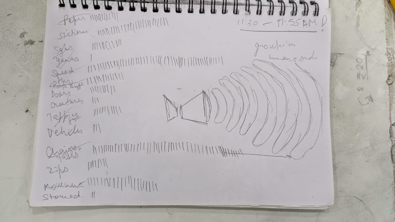
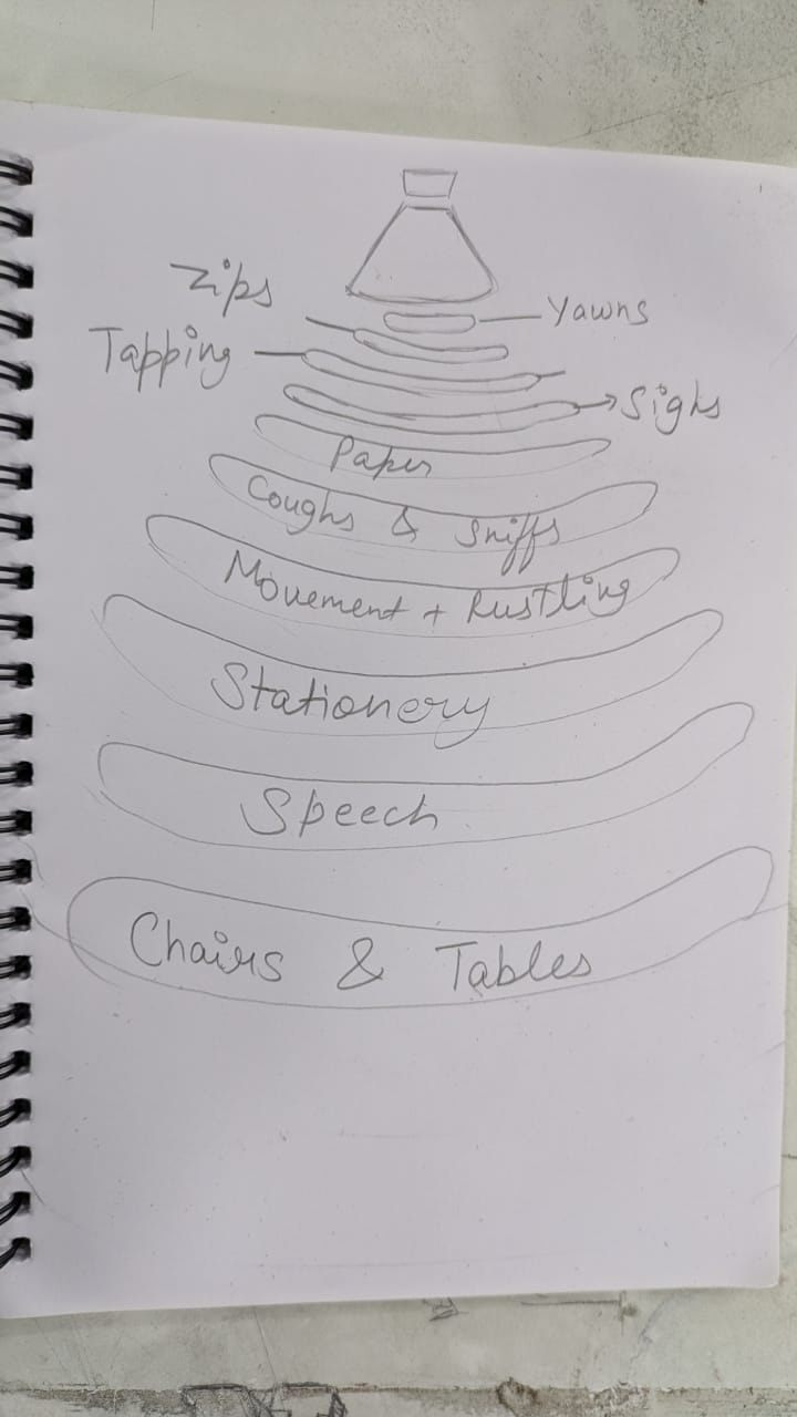
Joshna's visualisation of sounds in the classroom

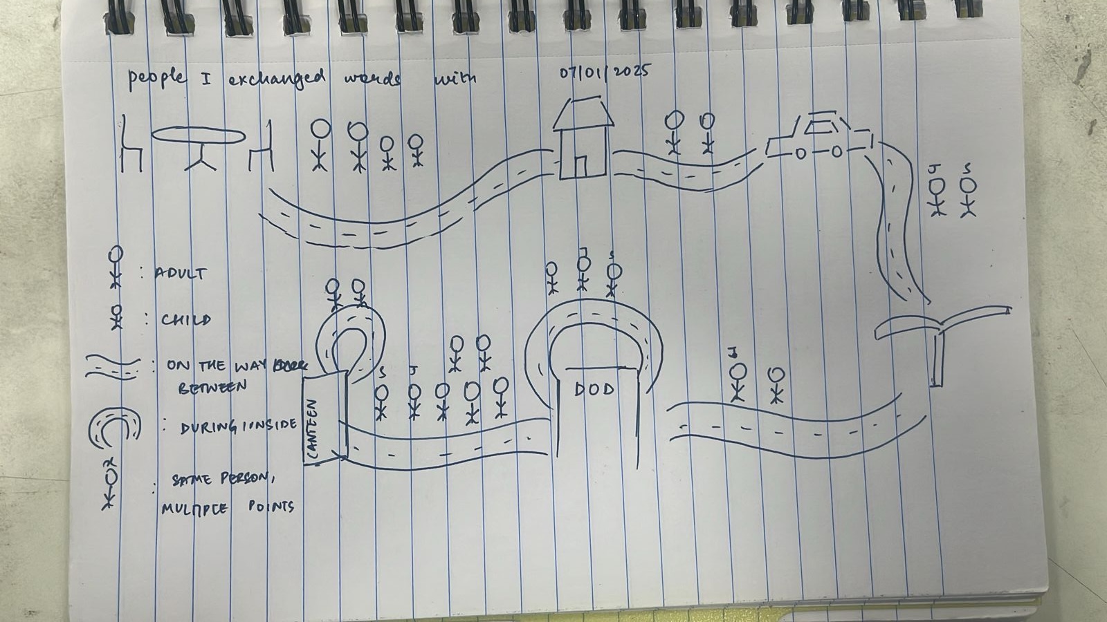
Kavya's visualisation people she exchanged words with