Developer-Designer dynamics
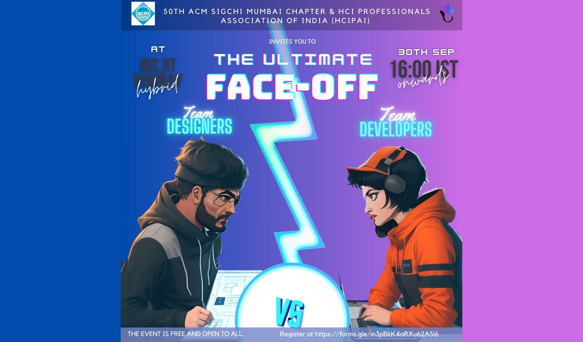
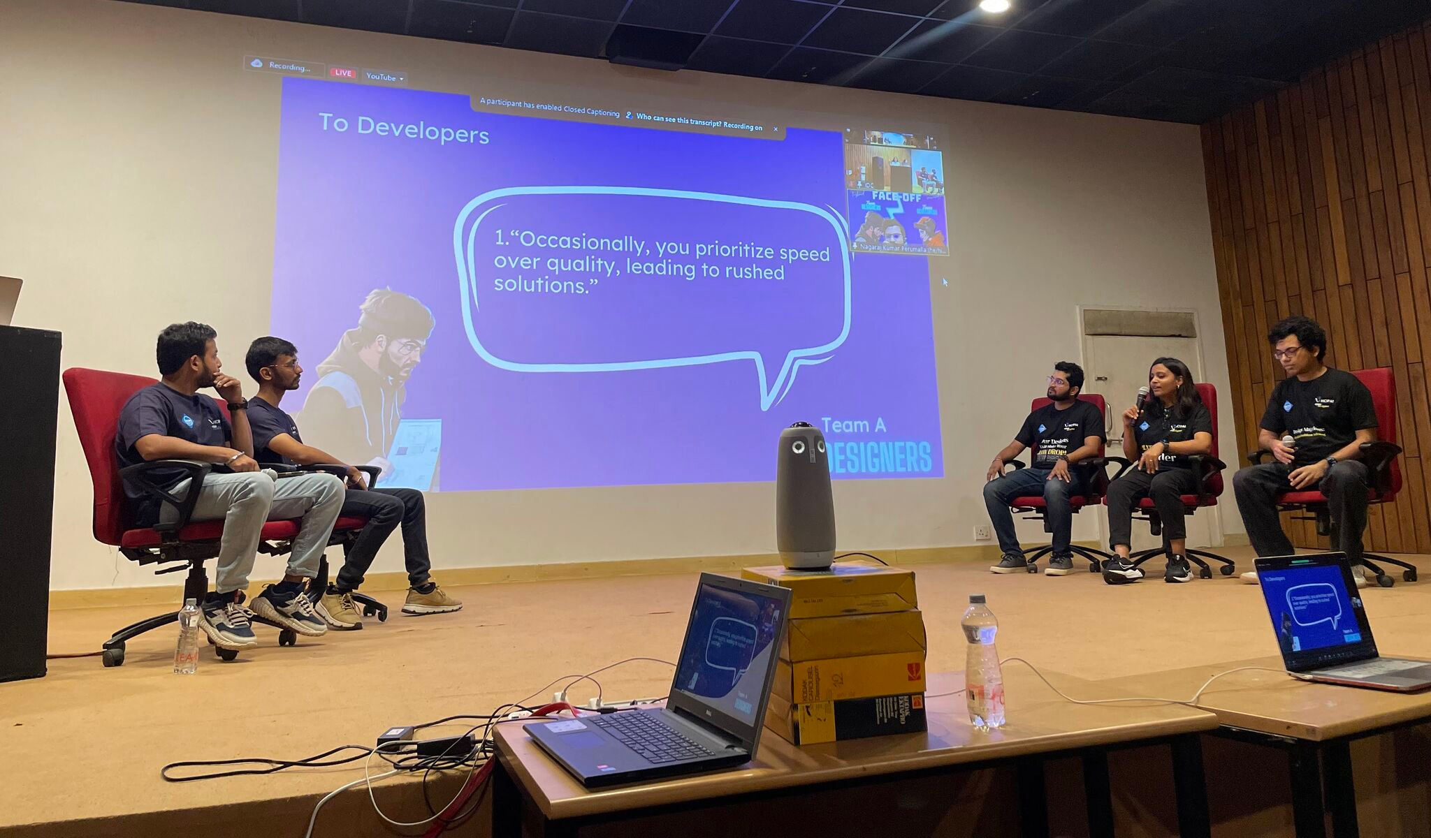
I was part of a panel called “The Ultimate Face-off” at IIT Bombay, organised by ACM SIGCHI Mumbai Chapter and HCI Professionals Association of India (HCIPAI), which pitted designers against developers to address common gripes each side had with the other. This article contains some of the ideas discussed at the panel.
Allegations on Designers
Designers create visually appealing design that are difficult to implement
The state of design tools is constantly moving towards more and more complexity, and we’re at the point where some design tools have enough detail in their file formats and work similarly enough to frontend code that they are able to spit out working, responsive code. Figma has plugins that can do this, and Webflow or Framer can do this natively. Complex animations can be handed off as a Lottie json and played back on any platform. If it can be designed, it can be implemented. If the designer you are working with is giving you things that are consistent with your design system, you shouldn’t find yourself in a position where correct sizing, padding, colors or motion are harder to do than incorrect values.
How can emerging technologies like design-to-code tools influence the ease of implementing complex designs?
Designers disregard responsive design principles, leading to inconsistent user experiences across different devices and screen sizes
Different devices have different affordances, and the word consistency gets thrown around a lot. I don’t feel that consistency means that the experience needs to be identical for different devices, there are earned differences based on the device - screen size, touch vs keyboard/mouse input, availability of cameras, microphones, speakers, gyroscopes, etc.
A website needs to work across a variety of devices, and there’s different design patterns for mobile devices and laptops/desktops, and tablets like iPads are kind of their own thing instead of just being a midpoint. There’s also voice interfaces, chat interfaces, 10 foot interfaces for TVs, and the experience for each point
It’s been standard practice to make desktop and mobile versions of web designs, and responsive design patterns are quite well established at this point. In my experience there has rarely been a moment where a developer and I disagreed on how to handle responsive designs. It’s possible that a case gets
What role do design systems and style guides play in helping designers maintain consistency across different devices and screen sizes?
Designers do not understand the technical feasibility of their design choices
Making products requires making tough decisions. There’s always a backlog of a hundred different things that the team could work on, and you always have finite resources, so prioritising items and timeboxing the amount of time spent on some tasks is necessary.
Every task has an effort to impact ratio - how much of the team’s effort will be required, and how much will it impact the product experience? This makes a lot of sense as a product maker, and I think any product manager will try and optimise for the team’s impact. It’s tempting to ignore the low impact issues altogether, address the low effort high impact things first, and put away the high effort high impact things for later.
Users don’t know or care about your effort estimations. If you put yourself in the shoes of the user, a minor, regular annoyance that is caused by a shortcut that the product team took to save a week of dev time is still a regular annoyance. As a designer, my job is to advocate for the user. Sometimes we’ll discuss designs and as a product team we’ll decide that it’s not feasible to provide all functionality in the first version and we collectively decide what makes the cut and what doesn’t. To start with a cut down version of the designs because I assume some things can’t be done are actually counter-productive, and makes me take decisions that I might not actually be qualified to make. As a designer I invite healthy conversations and there’s very rarely a directive from design to engineering to do something, and arguably that conversation with diverse viewpoints is crucial to have.
How can a design team ensure that creativity and innovation are not stifled while also keeping technical feasibility in mind?
Should designers code?
Designers do not adequately communicate the rationale behind their design decisions, making it challenging for developers to grasp the underlying user experience goals
This can be seen as an individual skill issue or as an organisational problem.
I usually invite developers to join in for user research sessions, both for open ended directional research and for user testing for specific flows. Developers very rarely attend these interviews, and while I think that a product maker should know and understand what the customer feels, there’s frequently just not enough time to do that. In fast-paced project timelines, effective communication may be sacrificed in the interest of meeting deadlines, and you run with the assumption that every product function knows what they’re doing.
Designers might not produce extensive documentation explaining the “why” behind their design decisions, focusing only on the “what” with the final design, and may assume that the visual elements are self-explanatory and underestimate the need for explicit communication. Knowing exactly how much documentation is required and what information should be shared takes experience.
How can design documentation be made more effective to convey the reasoning behind design choices?
Allegations on Developers
Developers do not prioritize scalability in design, which makes accommodating future changes challenging
Prioritising is always done based on current information. When future scope is not known, and there are other, possibly conflicting priorities like performance, security, and user experience, it can be difficult to achieve open ended extensibility.
Sometimes, existing systems have accrued so much technical debt that it’s challenging to prioritize scalability without a major refactor.
How can development teams incorporate scalability considerations without compromising on immediate project deliverables?
What role can senior developers and architects play in ensuring that scalability is prioritized in a project?
Developers prioritize speed over quality, leading to rushed solutions
Developers often work under tight deadlines, which can compel them to focus on delivering a functional product quickly rather than ensuring its overall quality.In fast-paced industries, being the first to market can offer a substantial competitive advantage.
Most developers take pride in their work and aim for high-quality solutions, even under time constraints. Experienced developers understand that compromising quality can lead to technical debt, which costs more time and resources in the long run.
Leadership in the organisation need to make craft a priority if they want high quality software. At Microsoft, we have recently established a process called Craft Reviews, where every time a new feature hits the internal build, the Designers and PMs on the project gets an alert to test the build. We have an internal checklist of things to test including alignment with redlines, light/dark/high contrast color modes, keyboard access, screenreader access, screen size responsive behaviour, etc. These bugs are immediately logged and triaged with the triad into P0, P1 or P2 bugs, and the build can not ship unless there are no P0 bugs. There was a lot of pushback against this idea initially because it was felt that this would slow us down, but this process has helped us catch a lot of bugs before they shipped to customers.
In what scenarios would it be justifiable to prioritize speed over quality, or vice versa?
Developers resist design feedback, hindering collaboration and preventing design improvements
I think accepting feedback in general is a difficult activity, and one of the things junior designers tend to struggle with as well. The tendency to start defending yourself when someone is offering feedback is one of the things design school knocked out of me, and something I’m glad for. Well meaning feedback from another person is a gift and an opportunity to improve your craft. Seeing it as hostility towards your work is setting yourself up for failure.
Developers may view design feedback as a time-consuming distraction rather than a constructive exercise. If designers are not clear in their feedback or fail to provide a rationale, developers may resist the changes due to confusion or skepticism.
In many organizations, code and product reviews are standard practice, making developers accustomed to, and accepting of, feedback.
How can a culture of open feedback be fostered among developers and designers to ensure seamless collaboration?
Are there effective strategies for timing the feedback loop so that it is neither disruptive nor ignored?
In what ways can project management tools or methodologies be employed to make the feedback process more structured and less prone to resistance?
Developers don’t follow pixel perfect design specifications and guidelines.
If the design guidelines are not detailed enough or if there is ambiguity, developers might take liberties that lead to deviations from the original design.
This remains a workflow challenge that hasn’t been solved too well by anyone. There are frequently issues like a developer struggling to download an asset because it’s nested 3 layers deep and they don’t realise they have to double click to reach it.
Figma has done some work on making the design process more like code with concepts like reusable components and variables and states, and “dev mode” that does some nifty things like show designs inside of the vs code code editor and have a different interface from the design interface.
Zeplin, which is a standalone software I used to use as a freelancer, had a better interface for this as it completely separated what Designers did from what Developers needed to see.
Either developers need to get a sense for design and how design softwares are organised, or the designer needs to make an effort to learn what implementation details are crucial to write down and express.
How important do you think pixel-perfect design is in the overall user experience, and does it justify the additional time and resources needed to achieve it?
Are there instances where deviating from pixel-perfect design might actually benefit the end product?


