Making chord diagrams with Circos Online
What is Circos?
Circos is a free and open source software package for visualizing data in a circular layout i.e. as chord diagrams. It has been featured in many scientific and other publications (including the covers of both Science and Nature), so it’s safe to say science people really like it.
Why Circos?
- It looks pretty.
- Circular layouts are great for exploring relationships between objects or positions.
- Highly customizable.
- High data-to-ink ratio.
- .svg or .png output, can be used for print.
- Scriptable, can be made part of an automated data pipeline.
- Did I mention it looks pretty?
Circos is ideal for creating publication-quality infographics and illustrations with a high data-to-ink ratio, richly layered data and pleasant symmetries. You have fine control each element in the figure to tailor its focus points and detail to your audience.
Use in Genomics
Circos is used extensively for the analysis of genomic alterations over time, or differences between two or more genomes. You can take a look here.
How can I use Circos?
From the Circos landing page…
Creation of images is controlled through a plain-text configuration file. There is no interactive user interface. This approach to configuration should be very familiar to you if you have UNIX experience.
The emphasis here is mine, but after spending a while trying to understand the complex system of config files you need to setup, I realised that there is also an online version called Circos Online that allows less flexibility and customization options, but can still be used for visualizing simple tables.
So let’s use Circos Online!
Now that we know what Circos can do, let’s try and use it!
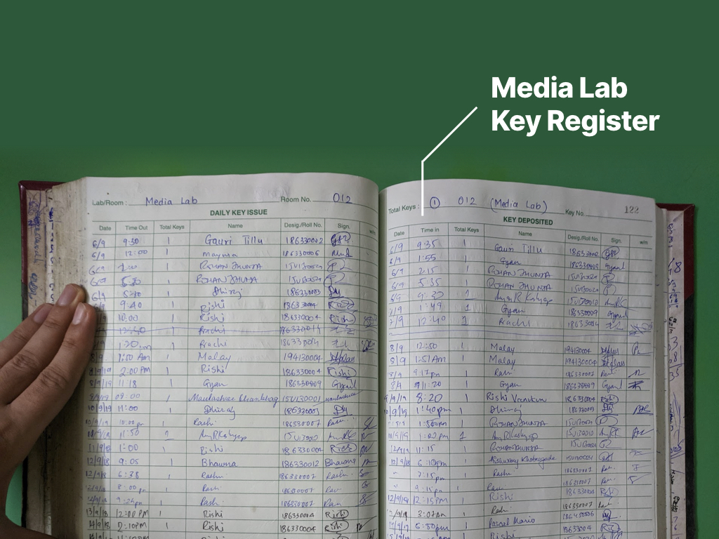
Pick a dataset.
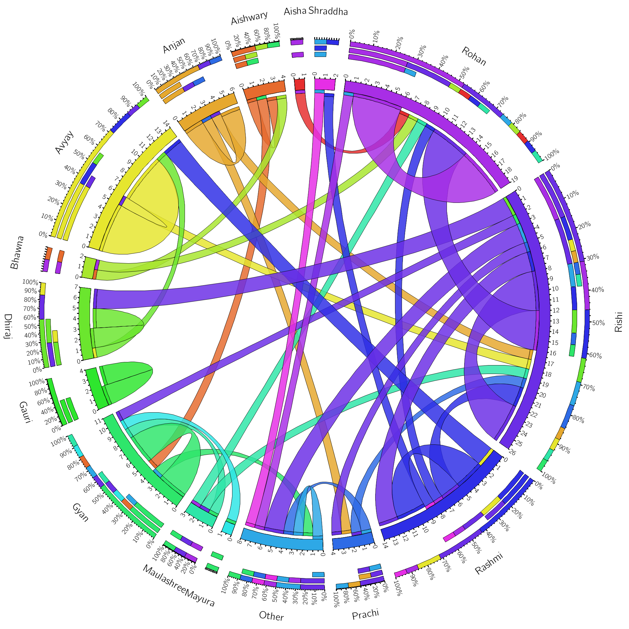
You can pick whatever you like, but I decided to visualize the patterns in key issue and return for the media lab at IDC. I used the last two filled pages of the key register, which looks like this:
Formatting the data
Circos uses :
- A matrix of data
- With headers for both rows and coloumns, headers can’t contain spaces
- Formatted as a tab separated values (.tsv) file
Putting tables into Circos
Chances are you have your data in a table, isolate just the two values you’d like to look at the relationship between. In my case, I took just the name of the person issuing the keys, and the name of the person returning the keys.
But that poses an issue as Circos can’t technically represent tables.
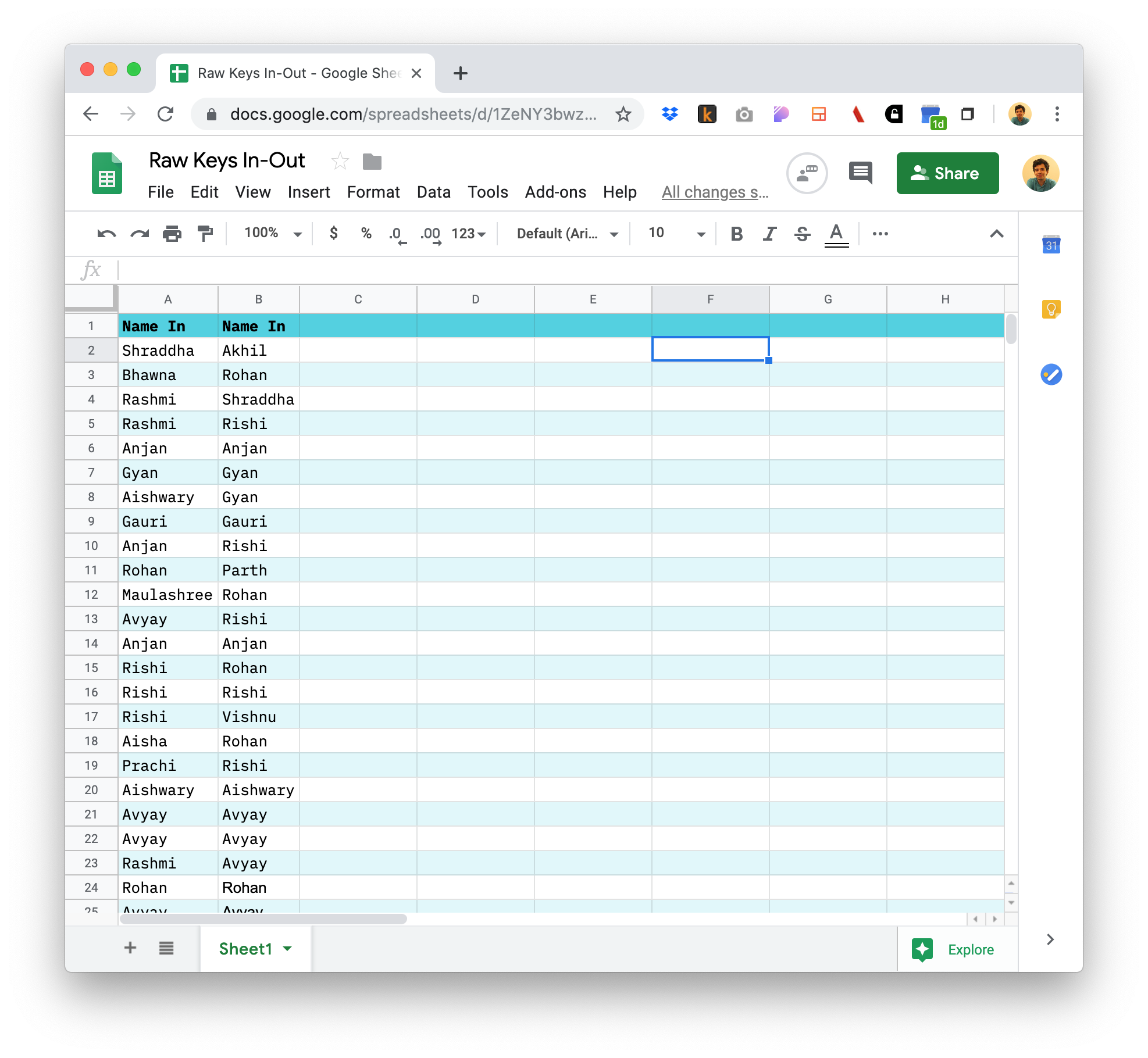
Wait so why are we doing this then?
What Circos can do is represent matrices. What’s the difference? In mathematics, a matrix is a rectangular array of numbers (whereas a table can have any kinds of values).
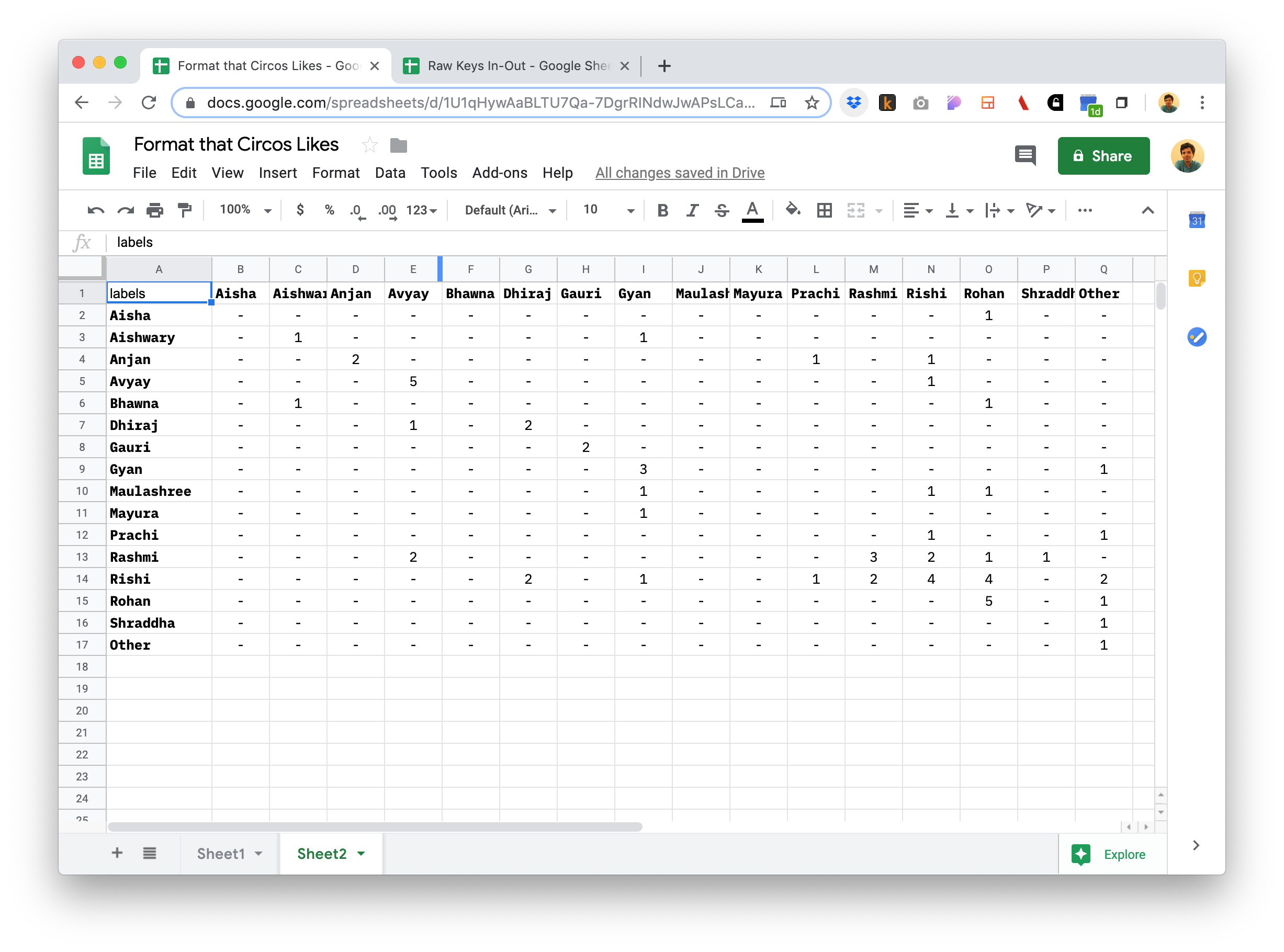
Turning tables into matrices
The matrix takes each pair of (key-in-person, key-out-person) data and inserts +1 into the corresponding position on the matrix. I did this manually, but if you can code, it’s essentially a matter of converting key-value pairs into a matrix
 .
.
Also remember to put the text “labels” on the top left cell, or Circos Online won’t accept the input. Make sure your headers don’t have any spaces in them, or Circos will fail and throw a bunch of scary looking errors at you.
Download a .tsv
In Google Sheets, go to File > Download > Tab-separated values (.tsv, Current sheet)
Upload .tsv to Circos
Upload the .tsv to Circos Online. Leave the checkboxes unchecked for now and click on Visualize Table.
The result
It may take a few seconds to load, but once it does, you can pat yourself on the back for a beautiful data visualization.
You can now download a large image or a zip with data, images (PNG/SVG) and configuration from Circos online.
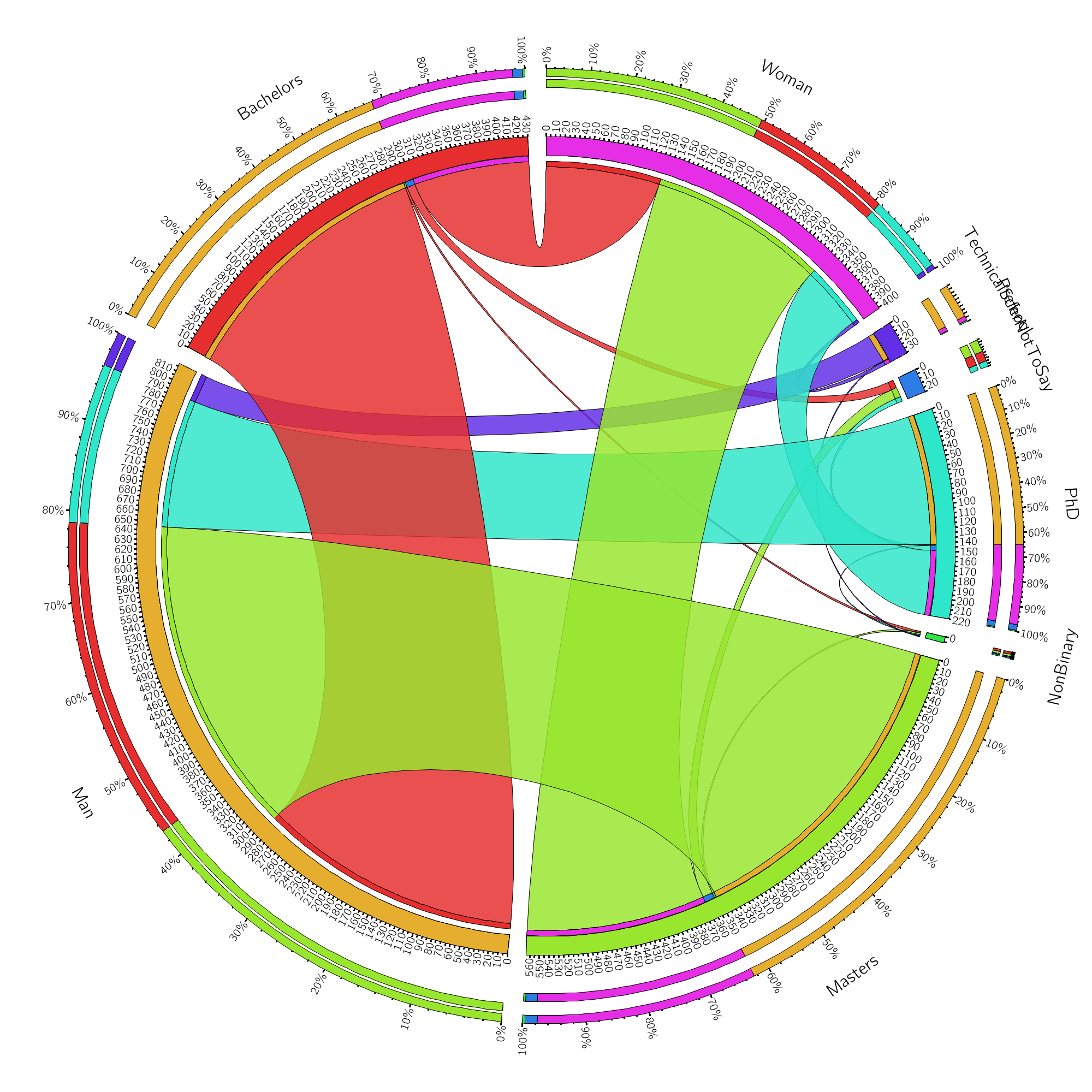
Let’s look at another example
This data comes from the Data Visualization Community Survey 2019 Challenge.
I extracted the education and gender for people who responded to the survey, and got this.
| Education | Gender | Count |
|---|---|---|
| Masters | Man | 353 |
| Bachelors | Man | 291 |
| Masters | Woman | 198 |
| PhD | Man | 143 |
| Bachelors | Woman | 128 |
| PhD | Woman | 72 |
| Technical School | Man | 31 |
| Masters | Prefer not to say | 11 |
| Bachelors | Prefer not to say | 9 |
| PhD | Prefer not to say | 5 |
| Technical School | Woman | 4 |
| Bachelors | Non-binary | 2 |
| Masters | Non-binary | 2 |
| Masters | Woman | 2 |
| Technical School | Non-binary | 1 |
| PhD | Non-binary | 1 |
After (once again, manually) converting to a matrix, we get this matrix.
| labels | Man | Woman | NonBinary | PreferNotToSay |
|---|---|---|---|---|
| Bachelors | 291 | 128 | 2 | 9 |
| Masters | 353 | 198 | 2 | 11 |
| PhD | 143 | 71 | 1 | 5 |
| TechnicalSchool | 31 | 4 | 1 | - |
Result
The result looks something like this: