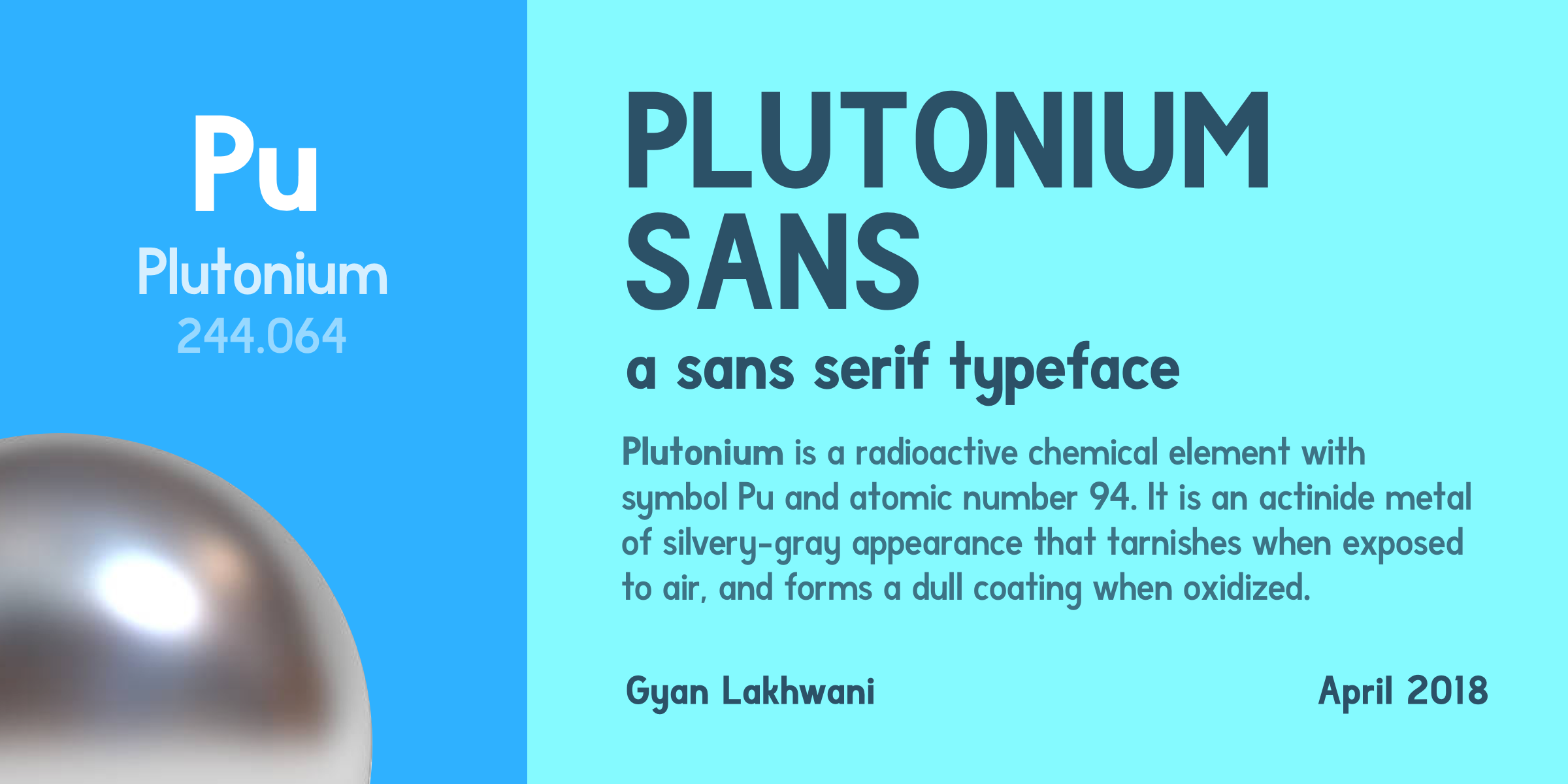
Plutonium Sans
A few months ago, I worked on a script typeface based on my handwriting. I called it Lettuce Party. It was my first foray into type design, and I came out of the experience with a lot of insights into what not to do when you are trying to design a typeface. This summer, I read Never Use Futura and decided to work on my own sans serif inspired by the geometric forms of Futura. This was the result.
Plutonium Sans
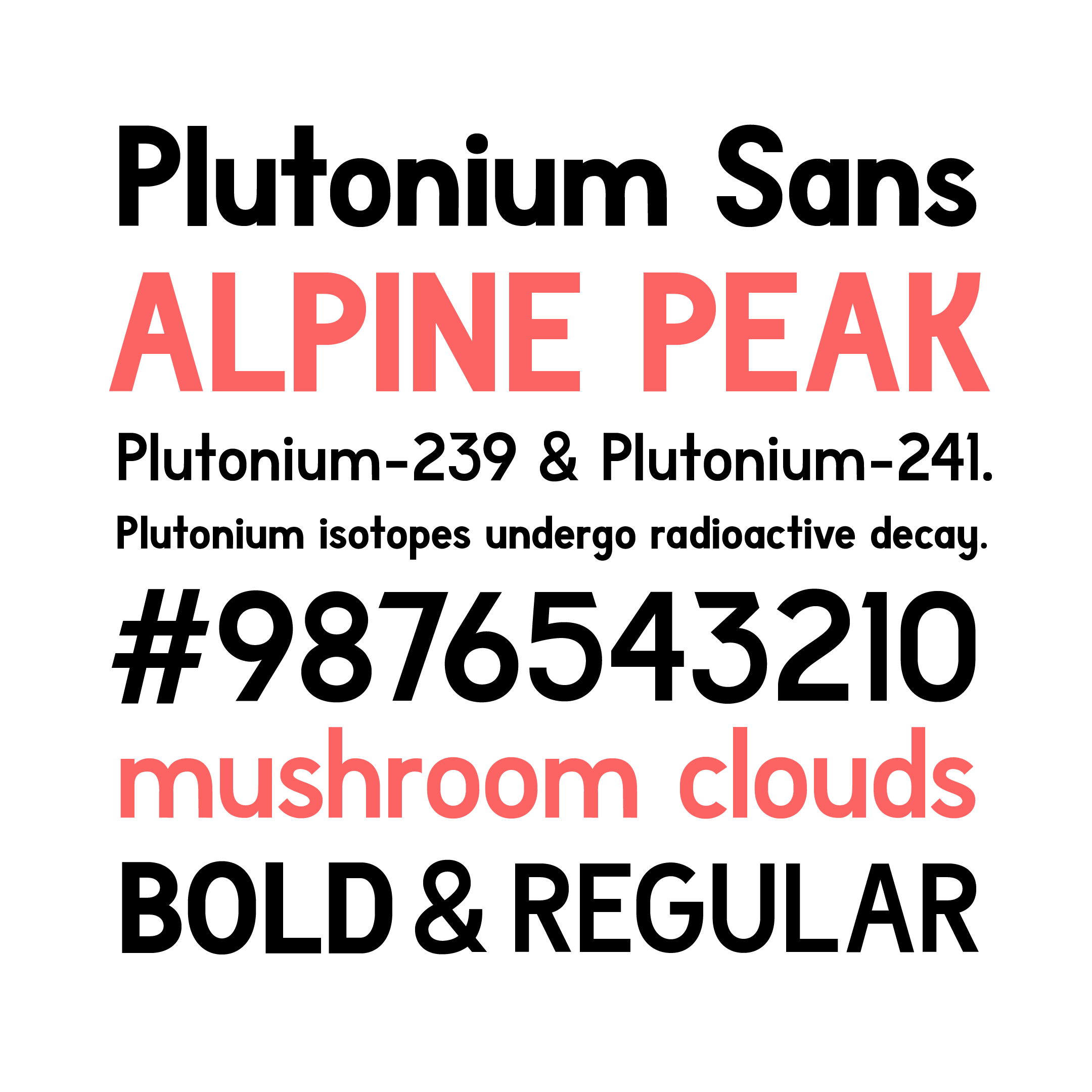
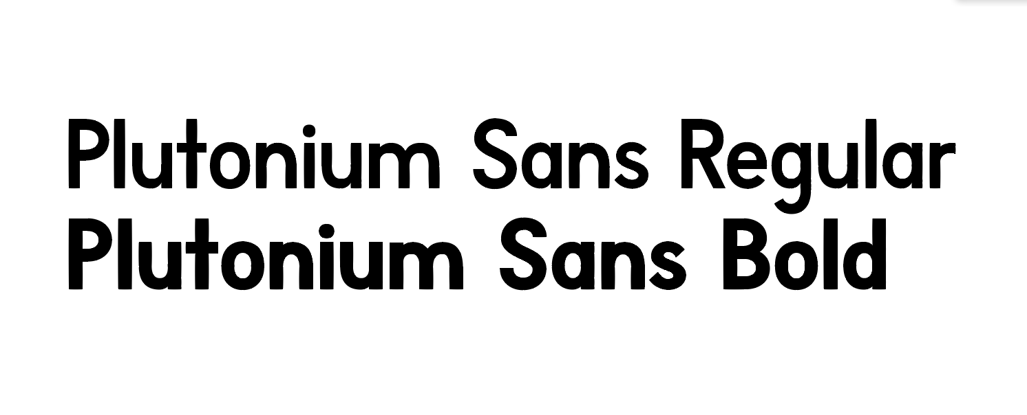
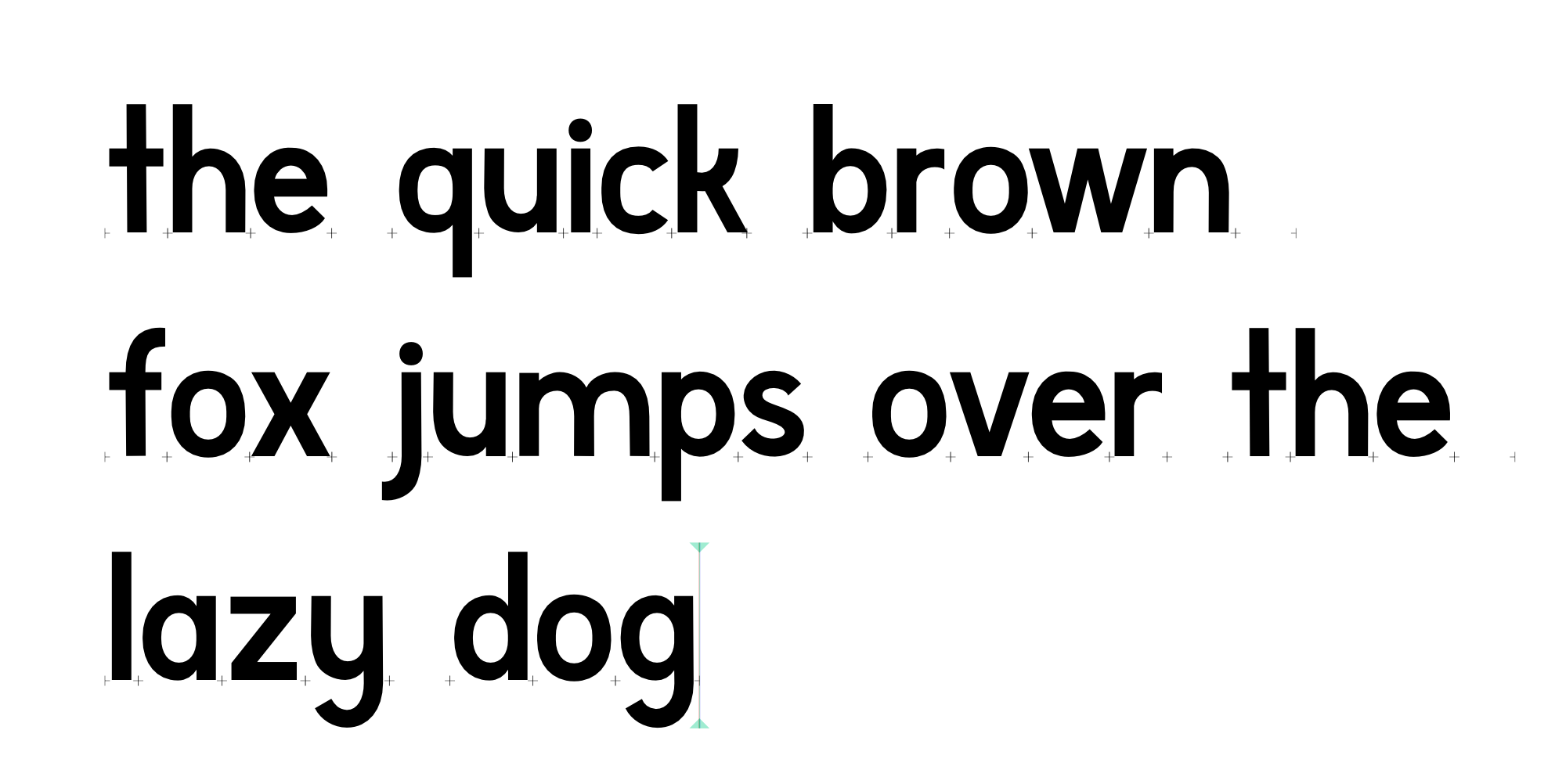
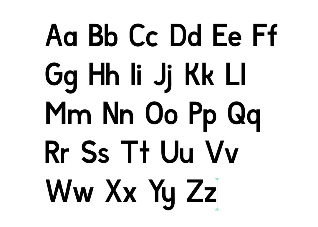
Type sample
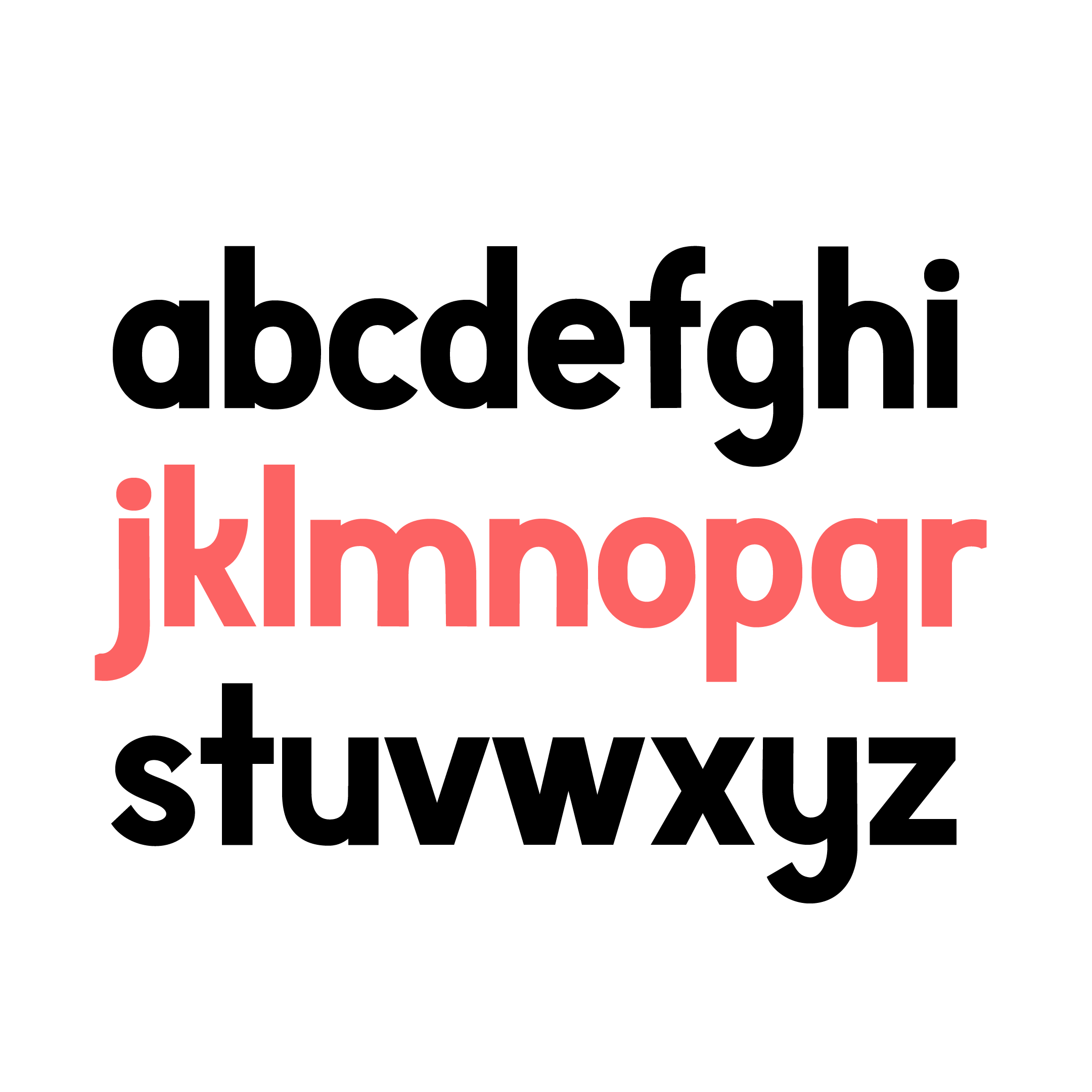
Lowercase letters (bold weight)
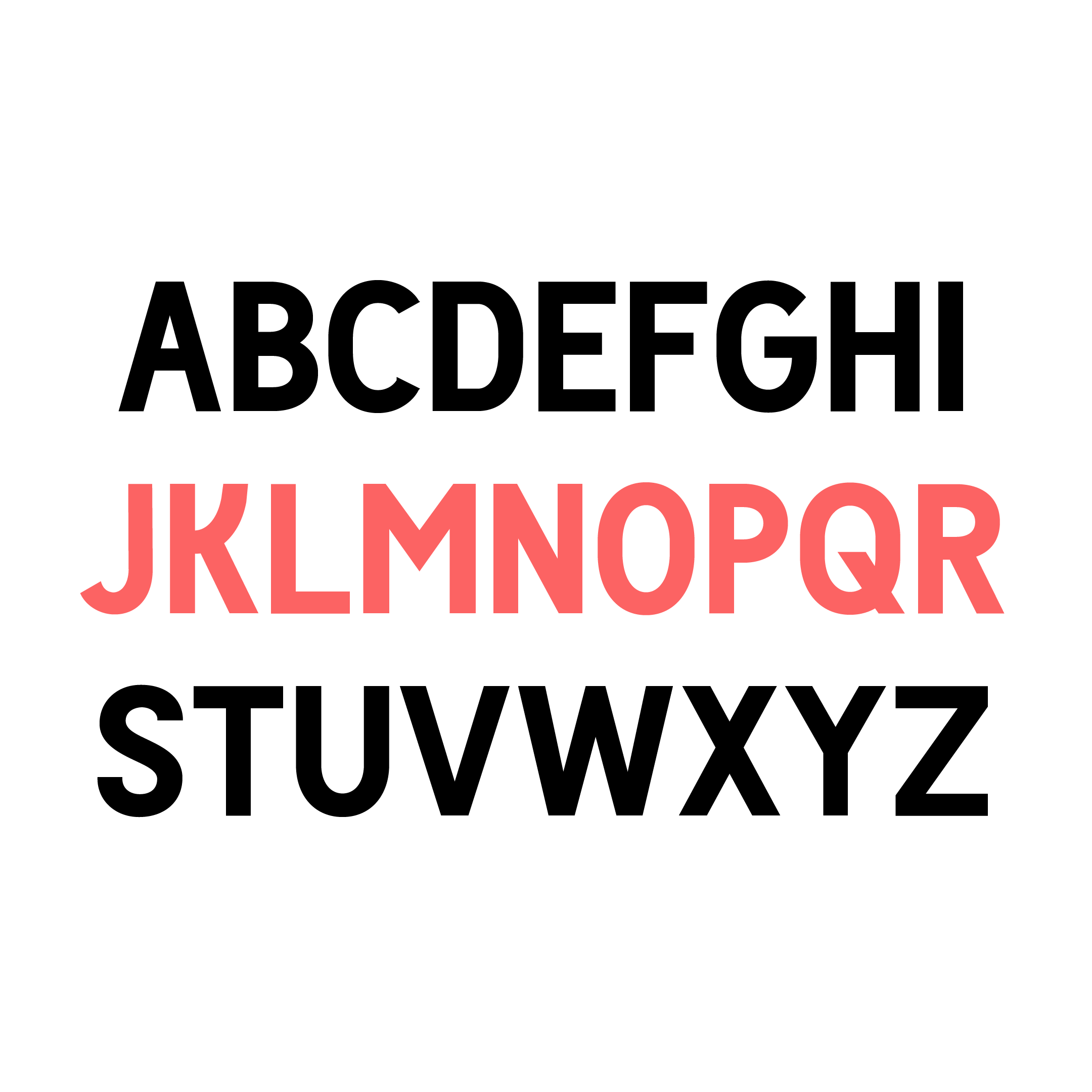
Capitals (regular weight)
Getting started
I started Lettuce Party with no previous experience or research into type design, which caused a lot of technical problems later in the process. This time I did my homework, and read about best practices for starting a type design project. This removed a lot of the trial and error of figuring out tools and techniques on my own, and made my workflow a lot more efficient.
Glyphs
I had previously used Birdfont, a free & open source font editor, but had found it confusing and badly documented. I was keen to try out other font editors, and settled on Glyphs for Mac. It’s a paid software with a 30 day trial that I used, and their website has some great tutorials to get you started.
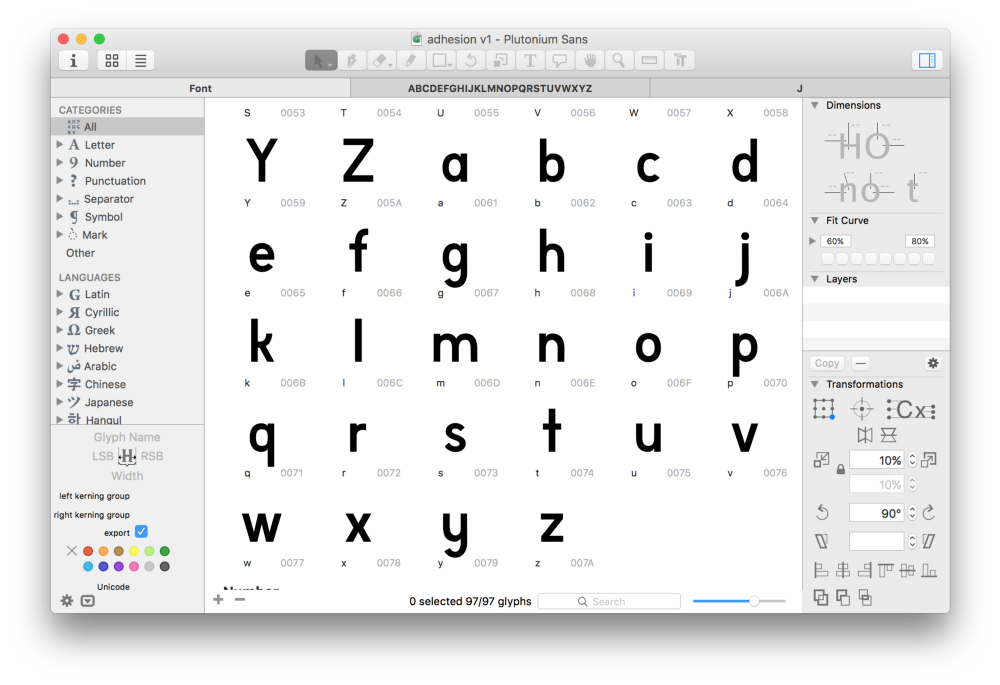
Glyphs for Mac
I used Illustrator to draw the HOno as control characters to define the look and feel of the typeface. I used Illustrator since that was what I was comfortable with, but I moved to Glyphs soon after and the pen tool quickly grew on me. Before long I had completed a first draft of the lowercase letters.
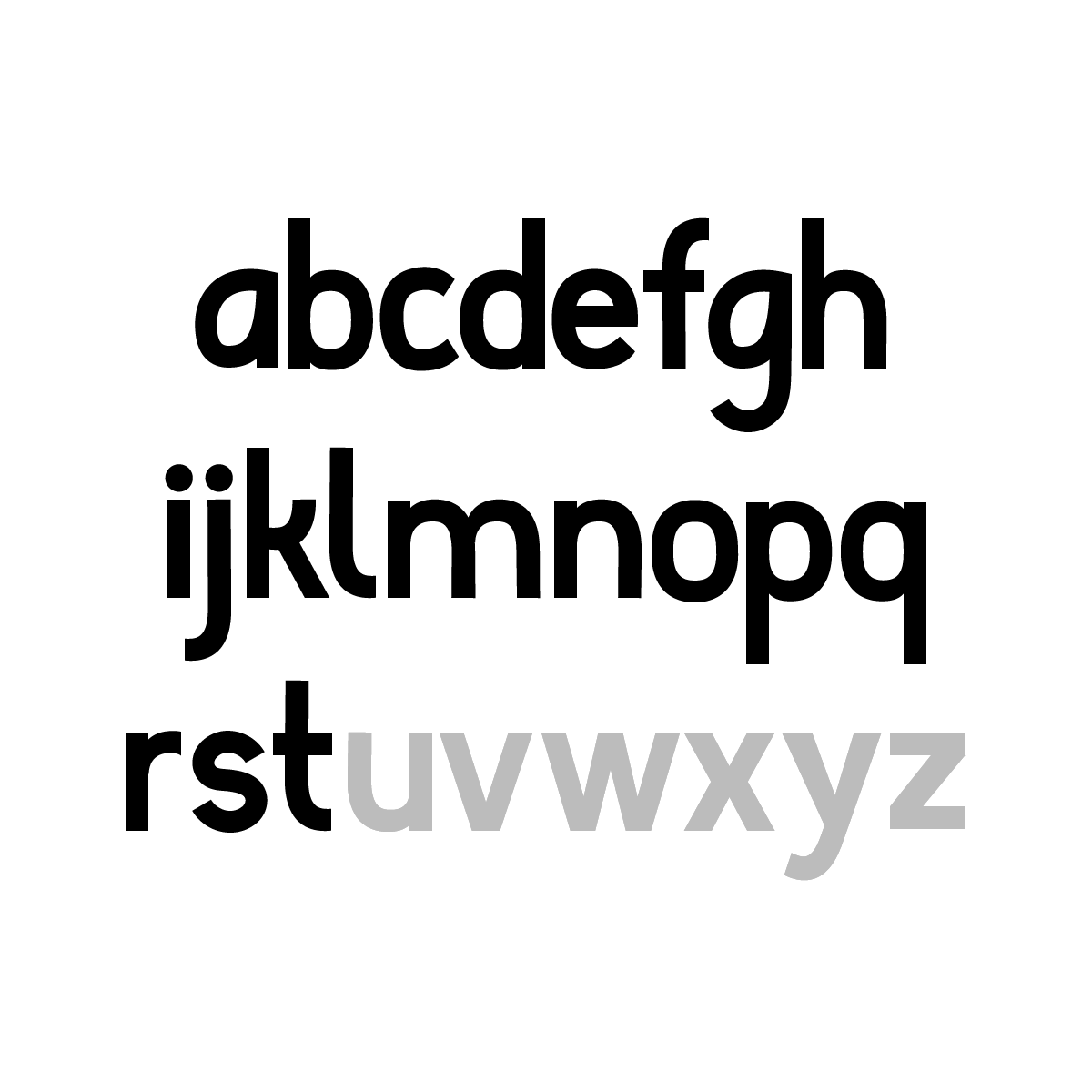
Early version of the lowercase letters from a to t.
Making words
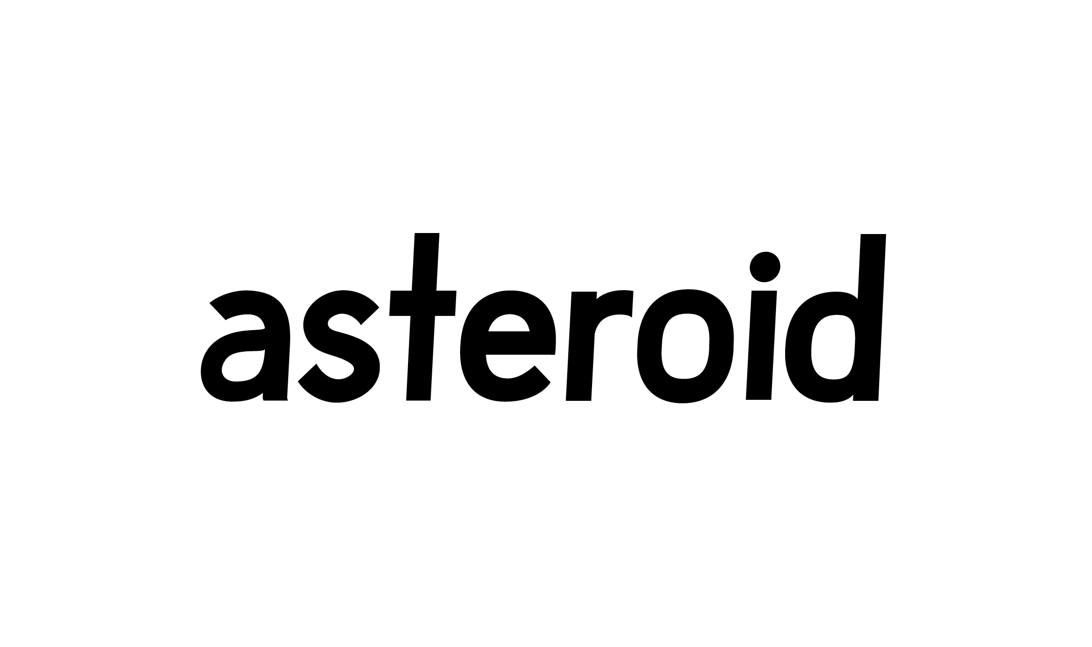
I started stringing letters into words to check how they looked together. Certain combinations of letters looked off, and it was helpful to compare characters side by side to see what worked and what didn’t. I tweaked things as I went along, and took screenshots of anything I liked so I could come back to ideas.
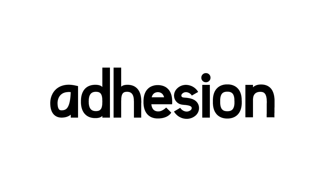
‘adhesion’ was one of the early words I used to test the font, and it also became my work in progress name for the font.
The early lowercase ‘a’ had a teardrop shape to it which felt a bit odd to me. I later tried a double storey ‘a’, and eventually abandoned for a more traditional geometric form.
Double storey ‘a’ in an exploration for an italic weight.
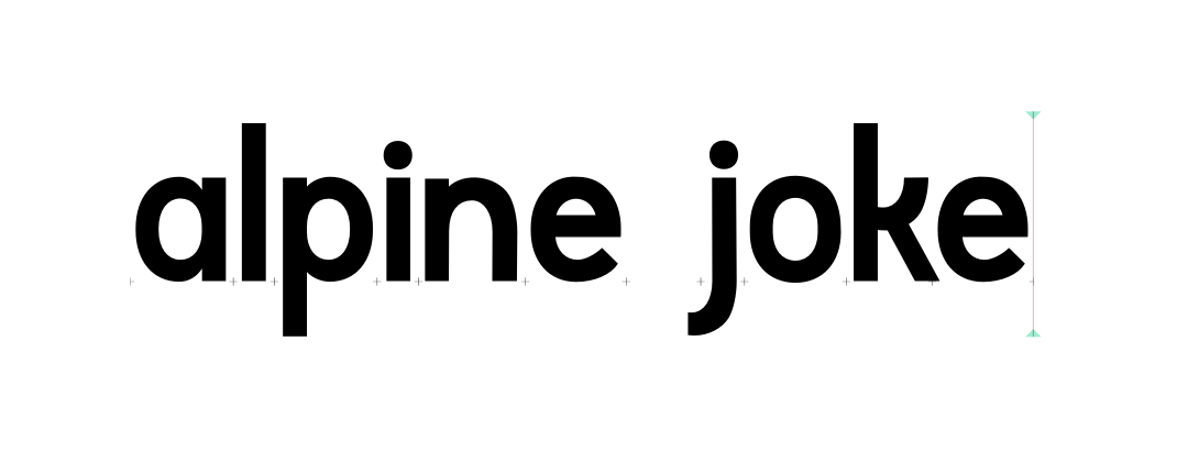
Alpine joke
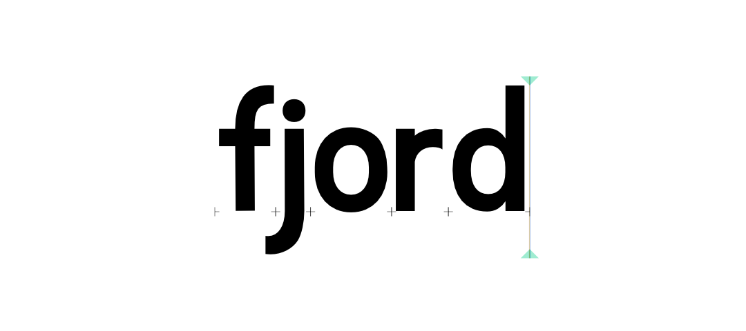
Fjord
Final lowercase glyphs
A few days later I was happy with my lowercase letters, and it was time to work on the uppercase. I followed a similar process of trial and error, creating a few characters and then stringing them together and making any modifications that felt appropriate. I did not want the typeface to look too formal, so I allowed myself to have some fun with some of the letters. I was particularly happy with how the k and y came out.
Upper and Lower case letters
Get Plutonium
I spent a lot of time polishing Plutonium and I learnt a lot in the process that I will hopefully use for my next font. While it’s not perfect and I wouldn’t recommend it for anything other than as a novelty display font, is at a stage where I feel comfortable sharing with people.
Plutonium is free for use for commercial or private projects. You can download the current version here.
Before you use
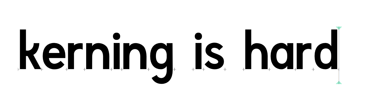
- No kerning whatsoever (I still haven’t fully wrapped my head around how to do it).
- The numerals and punctuation are a little rough.
- The bold and regular weights are too close to each other.
- Side effects may include dizziness or nausea (not really) (but no guarantees).