The Shape of the Tool
Let’s start with an example from calligraphy. Devanagari lettering, used for Hindi and other languages, is traditionally done with a pen angled at around 45 degrees. This angle is what gives Devanagari its characteristic shape, with its sweeping curves and distinctive loops. The shape of the tool, in this case, the angled pen, is what dictates what can be created with it. If you were to try to create Devanagari lettering with a straight pen, or use the 55 degree pen angle typically used by Latin calligraphy, it would look quite different. The character of Devanagari calligraphy is a very direct result of how the pen is shaped.
Adapting the idea of a Pit of Despair from this article: Falling Into The Pit of Success (codinghorror.com)
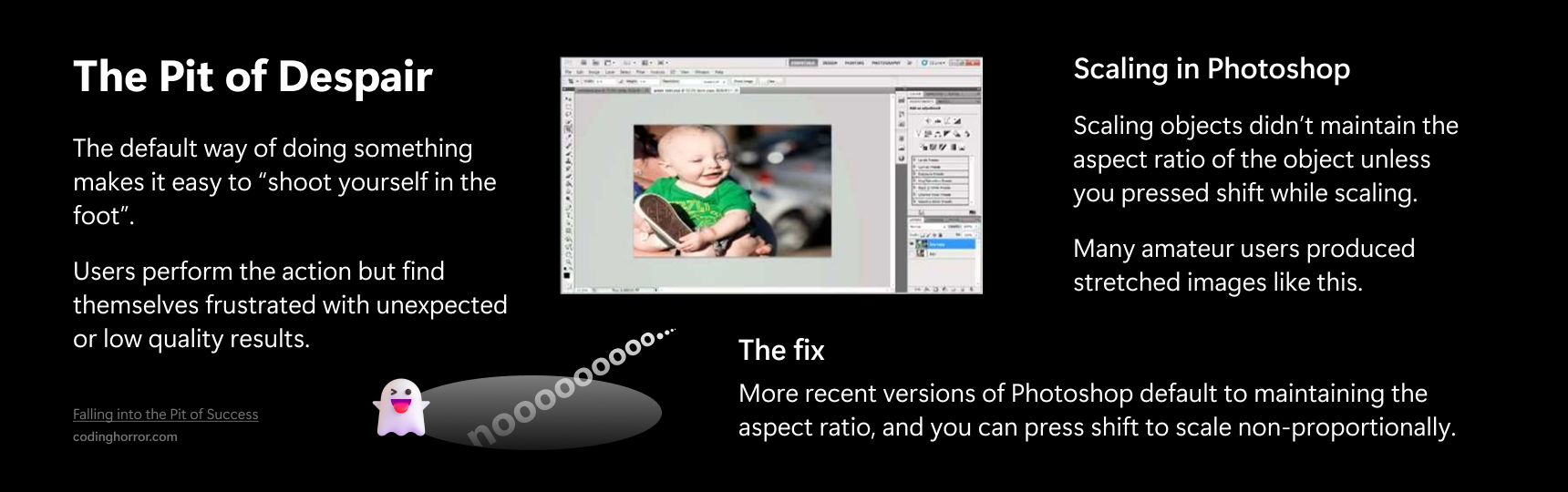
The impact of tool shape isn’t limited to calligraphy, as seen in digital tools like Photoshop. In previous versions of Photoshop, the default setting for the scale tool was non-proportional scaling. This meant that when an object was scaled, it was easy to stretch the image in one direction. Later versions of Photoshop changed the default setting to proportional scaling, which preserves the aspect ratio of the object being scaled. This change reduced the frequency of accidentally distorted images.
Adapting the idea of a Pit of Success from this article: Falling Into The Pit of Success (codinghorror.com)
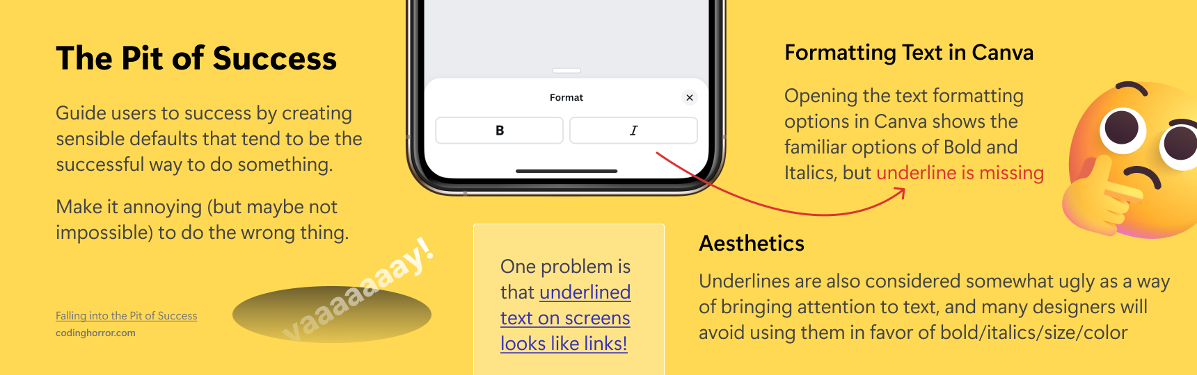
Another example is the graphic design tool Canva, which curiously lacks an underline option on the mobile app. Underlines have long been used as a way to emphasize words, and many of Canva’s users could want to use them to make some text stand out. The visual language of the internet, however, uses underlines to denote links. Canva avoids users accidentally making something look like a link by intentionally making it difficult to use underlines on their app.