
UI Design
Component Gallery
The Component Gallery lists how different design systems document a component. This is useful when deciding the behaviour of a component in your own design system.
More references
Land-book is a website design inspiration gallery.
Really Good Emails is similiar for emails.
ASCII Symbols
You can use some ASCII symbols like the interpunct (•) in your designs instead of using icons. You can find a bunch of these symbols at glyphy.io. These are useful when you want to separate two elements but want to keep them in the same line.
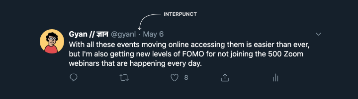
Twitter uses an interpunct between the username and date.
Icon packs
Using an icon pack saves a lot of time, and even defines the look and feel of your app to an extent. Google’s Material Design icons and Apple’s SF Icons are the default for Android and iOS respectively. Other icon packs you can look at include Feather, Phosphor and Font Awesome.
Brand Icons
Brand icons are one of those things you might need over and over, and it’s annoying to keep searching for “Facebook logo png”. A neat hack is installing the Font Awesome 5 fonts. These include the FontAwesome Brands font, and once you install it all you need to do is type in “facebook” into a textbox, and set the font to Font Awesome 5 Brands and the text will turn into the Facebook logo. You can find a list of all supported brand icons here.
Units
How do you decide what size to design at?
Print resolutions
For print documents, the concept of PPI refers to pixels per inch, or how many pixels you have in each physical inch.
Screen resolutions
For screen documents, the concept of DPI refers to dots per inch, or how many pixels you have in each physical inch.
Aspect Ratios
Up until the iPhone X, pretty much all phones had a 16:9 aspect ratio. Android phones usually had 720x1280 (HD) or 1080x1920 (Full HD) displays, and the iPhone 6/7/8 had a 750x1334 display.
Things are now a bit more complicated - Android phones can be 18:9 or even 21:9, meaning that there’s no single frame size that accurately depicts most phones.
Resizing frames without scaling content
Hold down Command (on Mac) or Control (on Windows) to resize a frame and ignore scaling or constraints set for any child elements.
How do you manage this then?
Designers that have studied and internalised grid systems may find it a little hard to adjust to digital systems where the canvas is always changing, and the size of elements is always changing as well. My approach is to just give in to the chaos—it’s not possible to control everything with the level of granularity you can have when designing a print document or a PDF.