Teaching Info Viz
I stumbled into teaching a data visualisation course in Jan 2025. I had just quit my job as a product designer at Microsoft, and I wanted to do all of the things I felt a full-time job made it hard to do. After asking around, I found that the Department of Design at DTU had an opening for a guest faculty to teach a semester long course on Data Visualisation. I said yes, and then found myself poring over notebooks from college, finding some long-forgotten notes from workshops I had attended, and looking through open course material from other infoviz courses to use as reference.

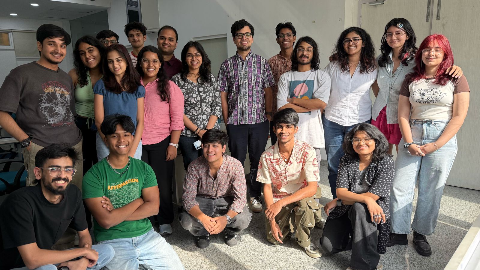
A class photo with some of my students
I had a full day of class every Tuesday with a class of 38 B.Des. students in their 3rd year of a 4 year undergraduate degree in design. I made a rough course structure to start with, and then spent my weekends putting together my decks.
Along the way, I had a number of questions I wished I had better answers to, and some observations that I noted for later reflection. Here are some of them.
- Code and tools - understanding data formats, data cleaning and processing pipelines, converting to desired formats is useful but daunting for (design) students.
- Data around us exercise.
- Some of the most interesting student work was in Figma instead of dedicated data viz tools. Interactivity, storytelling sometimes made the projects more interesting - students seemed willing to do the manual work, were frustrated when other tools didn’t offer enough flexibility.
- Data sources - I made a whole collection.
- Is there an Indian history of data visualisation? When we talk about the history of data visualisation, there’s a couple of things most sources refer to - Florence Nightingale’s diagrams about deaths on and off the battle field, John Snow’s cholera maps, William Playfair’s import/export charts, Jaques Bertin’s work on maps. When talking about data/info viz in an Indian context, what are other things that could be brought up?
- A lot of students were showing up with iPads for notetaking.


