Checklists in Microsoft Word
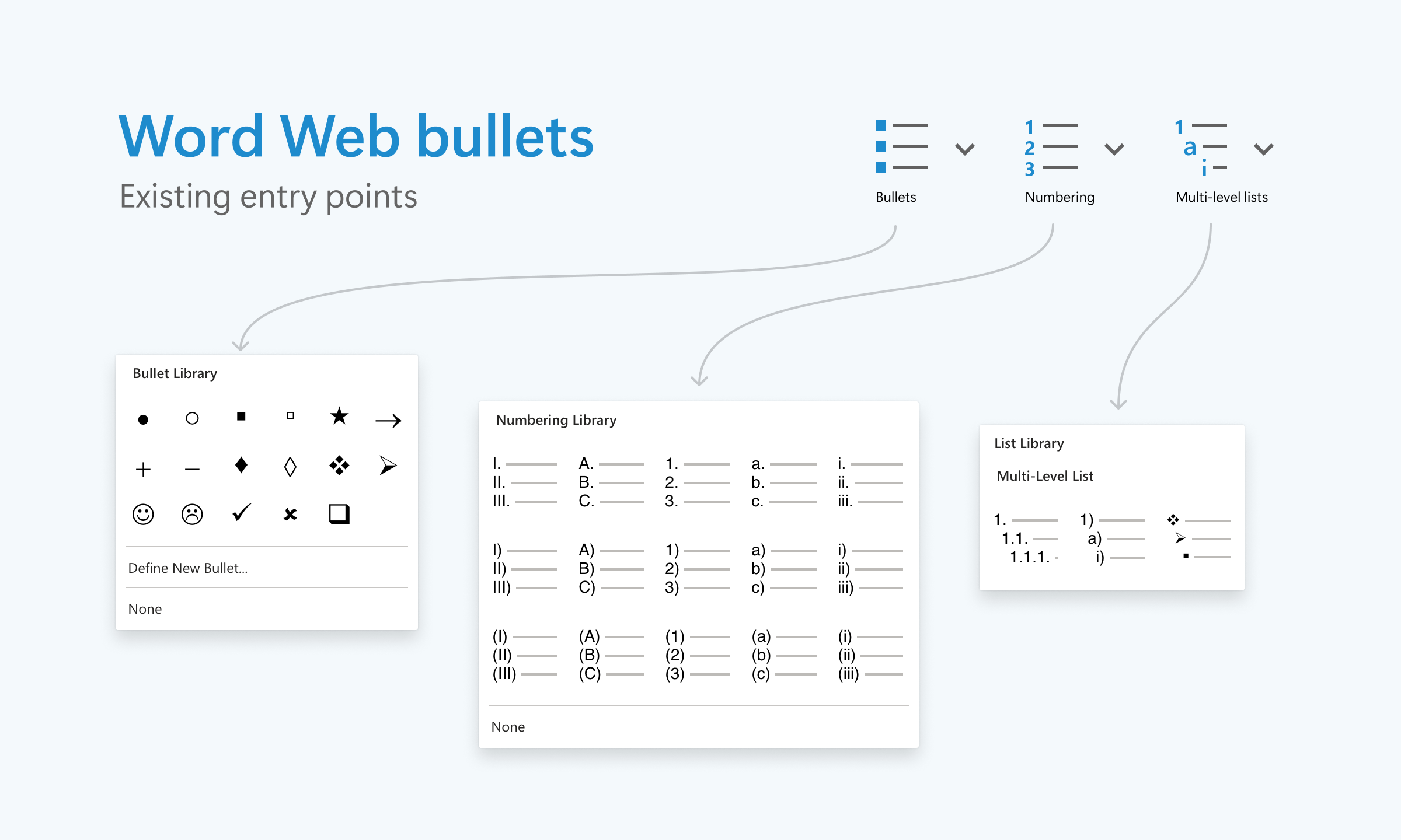
I once found myself tasked with adding checklists to Microsoft Word. I initially did not believe that this was too complicated. The problem statement seemed straightforward. Word already has 3 types of lists—bullet lists, numbered lists, and multi-level lists. What should the checklists experience for Word be like?

Bullets, numbering, and multi-level lists.
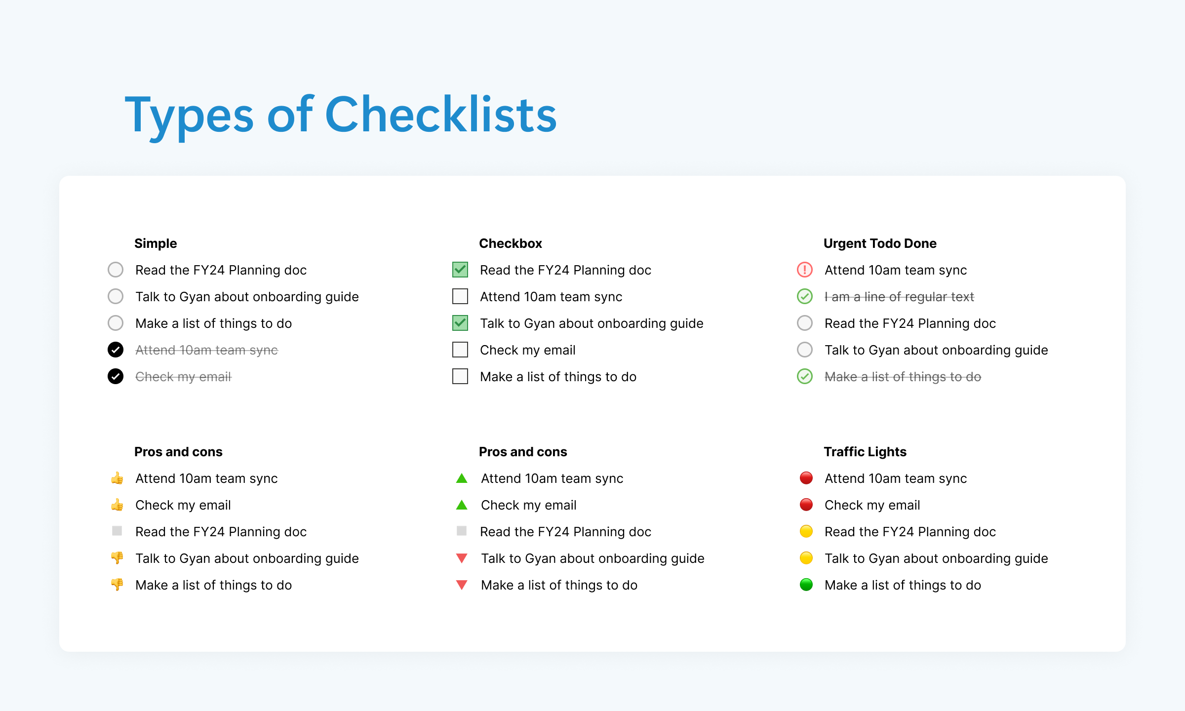
Checklists as a UI pattern are also pretty well established. You click a checklist marker, and the item switches to a checked state. Click it again, and it’s back to unchecked. That’s checklist behavior 101. I began exploring whether there was more we could do. What if we introduced a third state? Perhaps an “urgent” state for tasks that require special attention? This simple interaction could potentially add a whole new layer of utility.

Some potential types of checklists that explored different use cases and visual markers
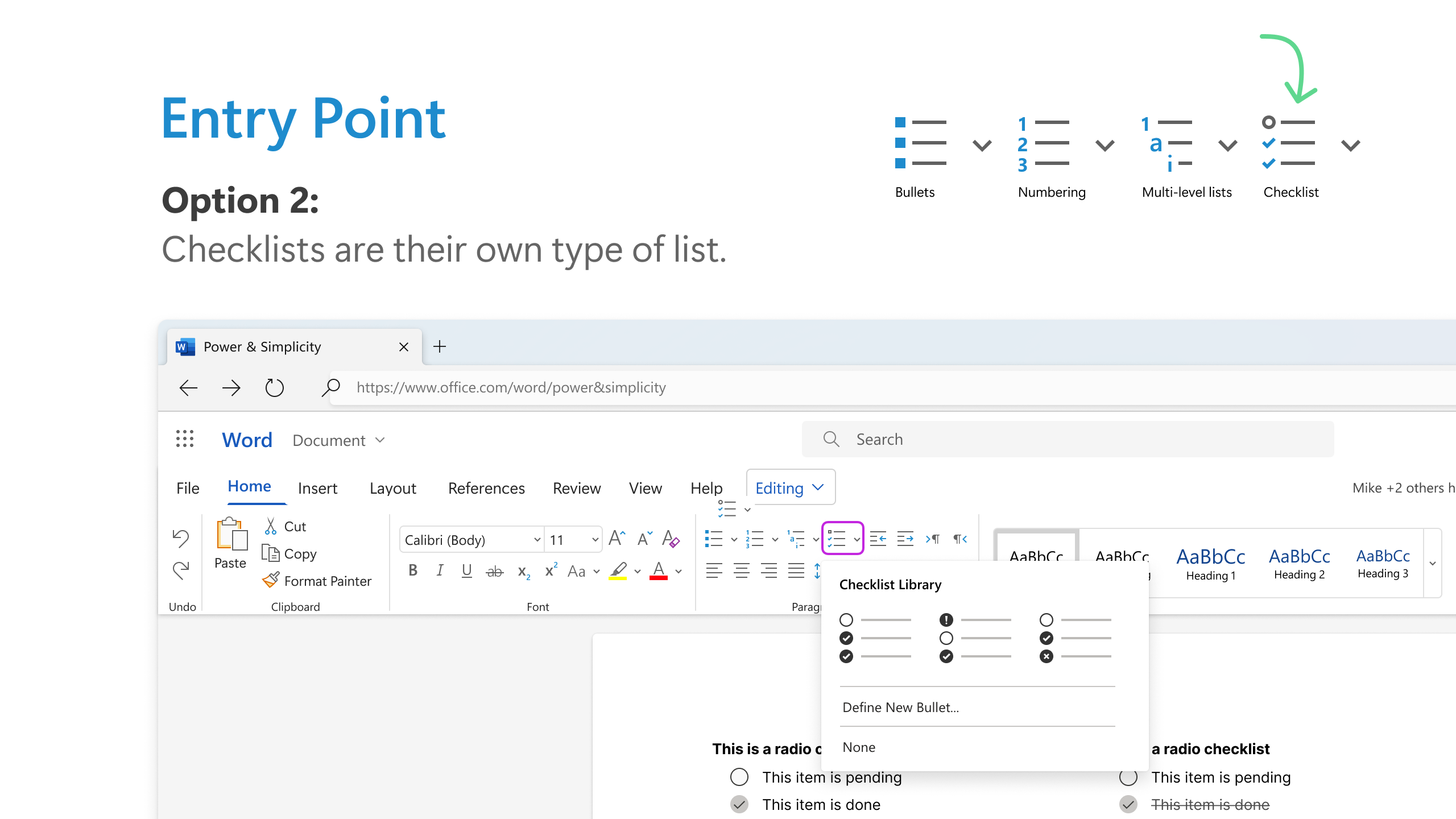
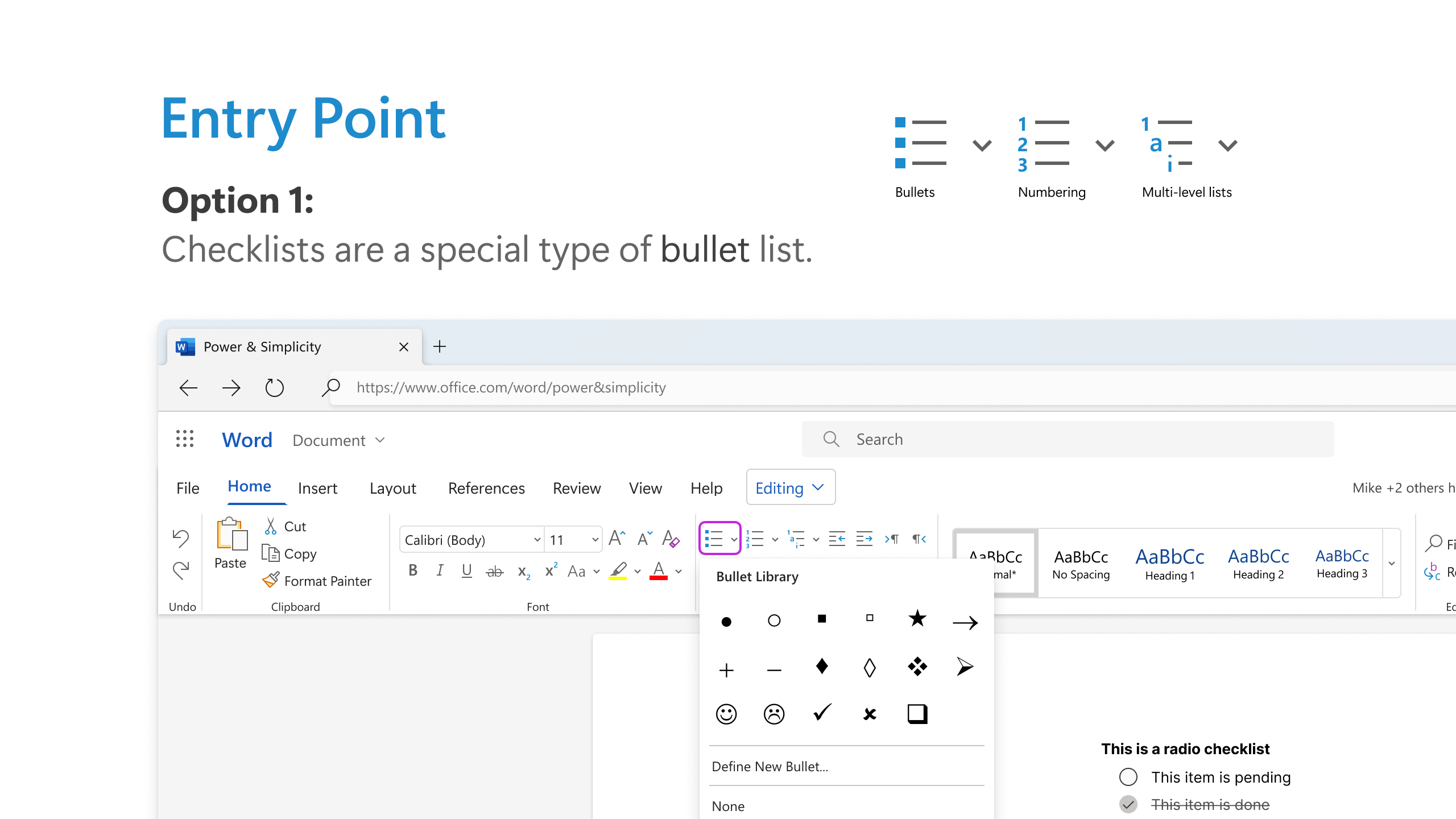
From a design perspective, checklists could be treated as a special case of bullet lists, or we could give them a standalone entry point in the ribbon for greater discoverability. The latter approach won out because it was important for users to be able to find this new feature in order to use it.
The challenge
Working on a product that’s been around for 40 years sometimes throws some really unique challenges at you. After I designed some of these neat little mockups, I found myself in a seemingly impossible situation. The Word Web team was convinced that checklists would be a useful addition to Word. The myriad other platform teams (Windows, Mac, Android, iPad, iOS) were not as convinced, and also had their own priorities and backlogs.
After some discussion, it was agreed that the Web team could try implementing the feature as an experiment, but would not initially get any bandwidth from any of the other platform teams. Target metrics were defined, and if they were met then the other teams would pick up the work later. This seemed fair enough.
The tricky part was that documents created on Word for Web needed to continue to render correctly on all the other platforms. While Word Web users always see the latest version of the software every time they load a document in their browser, many Desktop users bought versions of Word developed years ago and continue to use them. We couldn’t have users opening documents filled with mysterious blank squares or error symbols where checkboxes should be.
Revised Problem Statement
How might we implement checklists in Microsoft Word so that they work on every version of Word released in the past few years Web, Windows, Mac, Android & iOS with no code changes on those platforms?
The solution we landed on was to implement the checklist as a special type of bullet list. This allowed us to leverage an existing framework while avoiding the need for major changes across platforms.
Custom markers were out of the question—introducing any new markers would have resulted in rendering issues on older versions of Word, which wasn’t an acceptable outcome.
The key was finding an ASCII character within the Segoe UI Symbol font, which is shipped with every version of Word, to serve as both the checked and unchecked icons. This ensured compatibility across the board.
That’s when the real challenge hit me. Documents created in Word for Web needed to render correctly across all other platforms—including older versions of Word that hadn’t been updated in years. We couldn’t have users opening documents filled with mysterious blank squares or error symbols where checkboxes should be.
Custom markers were out—they’d cause rendering issues on versions that didn’t recognize them. We needed a solution that was innovative yet rooted in existing capabilities.
Late one night, fueled by too much caffeine and a stubborn refusal to admit defeat, inspiration struck. What if we could leverage something already built into Word’s DNA?
I dove into the character map of the Segoe UI Symbol font, a typeface included with every version of Word. There, among the myriad of symbols, were the perfect candidates: empty squares for unchecked boxes and checked squares for completed items. These ASCII characters could serve as our checklist markers without introducing any new elements that might trip up older versions.
Excited, I crafted a prototype. By treating the checklist as a specialized bullet list and using these universally recognized symbols, we could create a seamless experience. The checkboxes appeared correctly on every platform, and interacting with them on Word for Web updated the document without breaking compatibility elsewhere.
The next day, I demonstrated the solution to the team. There was a moment of silence—a collective holding of breath—as they processed the idea. Then, smiles spread around the room. “This could actually work,” someone murmured.
We moved forward with development, ironing out the nuances and ensuring that the feature felt intuitive. The checklists rolled out quietly at first, but word spread quickly. Users loved the added functionality, and feedback was overwhelmingly positive.
As the usage metrics rolled in, even the most skeptical platform teams took notice. The feature surpassed our targets for engagement, and soon discussions began about bringing it to other versions of Word. One by one, the platforms embraced checklists, adapting them to their ecosystems.
Reflecting on the journey, I realized that what began as a seemingly simple task had transformed into a complex puzzle. It pushed me to think creatively within constraints, collaborate across diverse teams, and ultimately, deliver a feature that genuinely enhanced the user experience.
And to think—I almost laughed at the simplicity of adding a checklist to Word. Lesson learned: in the world of software development, nothing is ever as straightforward as it seems. But with a bit of ingenuity and a lot of persistence, even the toughest challenges can be overcome.


