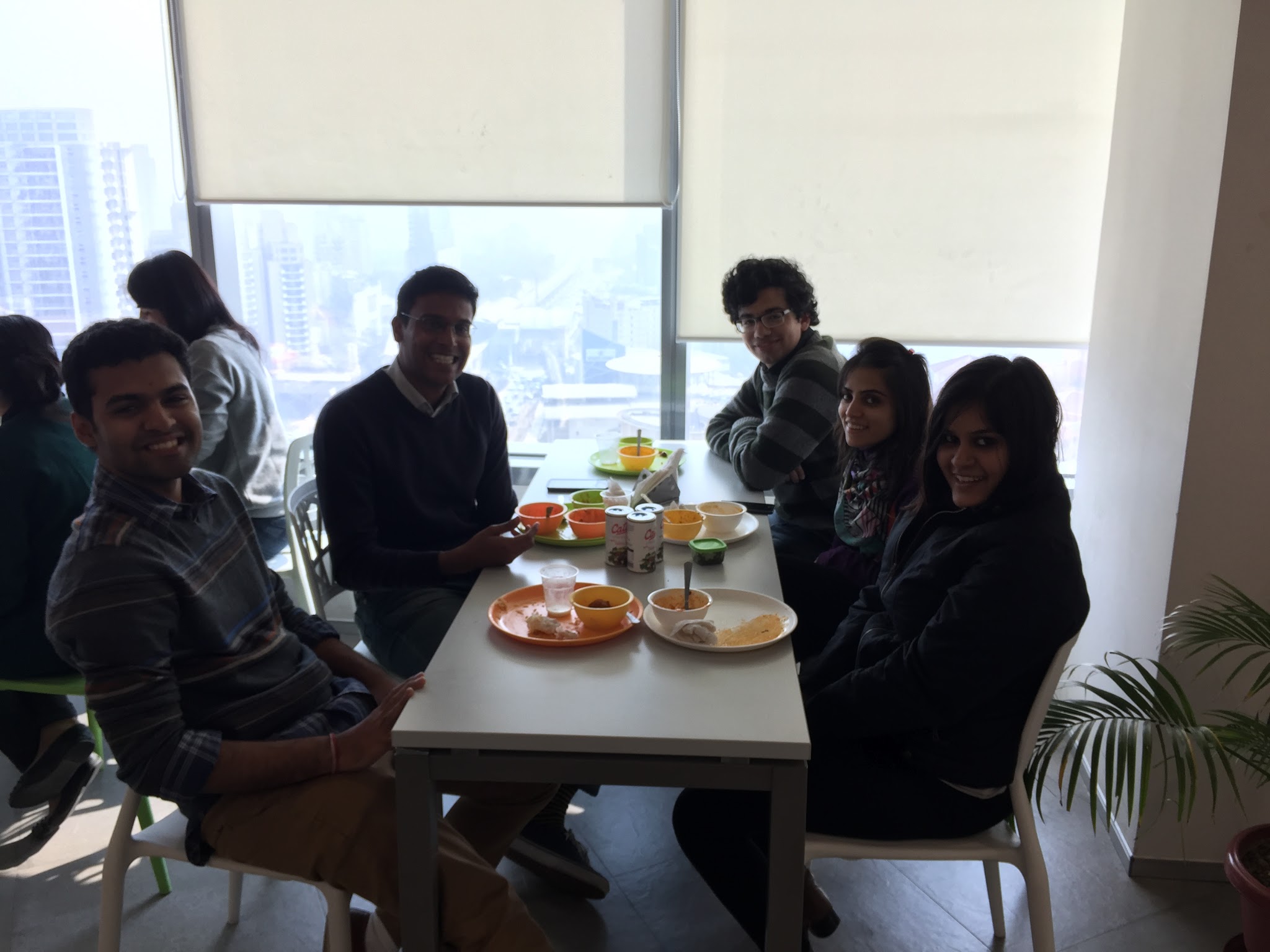
Interning at Zomato
How did I get here?
I’ve been working as a freelance designer for a while now, and this has been a constant learning experience. In the past three years I’ve done branding work, made print posters and magazines, created illustrations and infographics, designed and coded websites, worked on interface design for mobile apps, and conducted user research, and worked with over 30 startups and businesses. As the sole designer at most places I worked, I was often the only one advocating for the user and pushing for design thinking. I’ve enjoyed the freedom this has afforded me to do things my way, but I’ve also always wanted to work with other designers, and I’d been looking for a chance to work as part of a design team for a while.
Say hello to doodle Gyan.
In November 2016, I went for a Product Thinking workshop organized by the Zomato design team. After a pretty interesting talk, I talked to the team over pizza, and asked them about the possibility of interning with Zomato in the winter. I sent over my portfolio, interviewed with them a few days later, and started work as an intern on the Product Design team in December 2016.
My apologies to the otherwise much nicer looking team at Zomato.
What I did
I signed an NDA so I can’t show my work, but I used field research and inputs from Zomato’s Collections and Engineering teams to streamline their data collection process from restaurants, and redesigned their internal data collection app using Zomato’s design system in Sketch. I then created Invision prototypes and conducted usability testing on the redesign. As a second project I also worked on designing an iMessage sticker pack for the Zomato iOS app.
What I learnt
1. Do your research.
With a lot of projects, I’ve made design decisions by trying to put myself in the user’s shoes — because I had no actual data to go on. Empathising with the user is important, but it’s not a substitute for actual user research. The first time I went out into the field to conduct research, I was blown away by how many of my assumptions about the users were wrong.
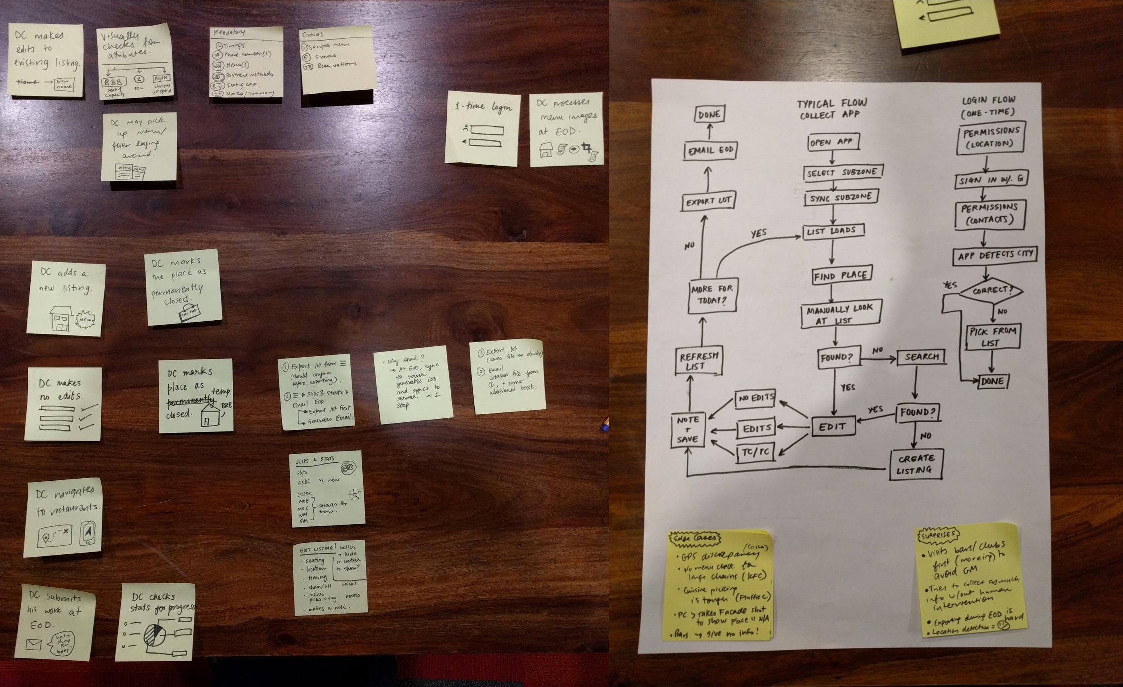
I worked with my mentor Ais to map out all the actions a user could perform with the app and created a flow chart to understand the sequence of events. This acted as a helpful reference later.
2. Start on paper.
I’d been using Sketch so much for so long that I’d started feeling like it’s faster for me to design directly in Sketch. Sketch definitely is really really quick once you learn it, but sketching on paper first lets you think of the why behind design decisions before jumping into detailing each pixel. Regardless of how efficient your digital flow is, it hurts a lot less to discard bad ideas when they’re just squiggles on paper. If I could go back and do one thing differently, I’d plan out the entire app on paper before I moved to a screen — I’ve wasted a lot of time making changes to pixel perfect screens where I had to move everything else around to accommodate an idea I just had.
3. Validate with users.
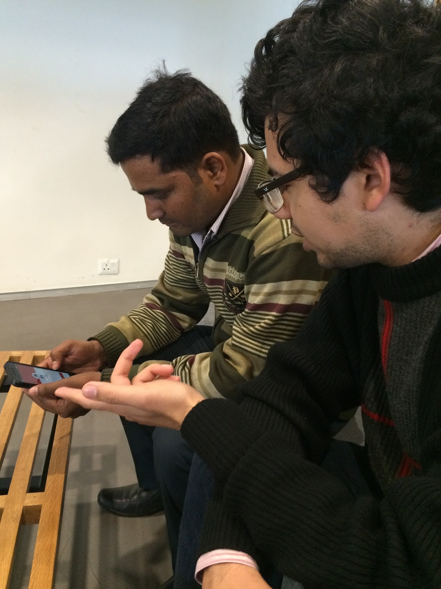
Testing a clickable prototype of the app with a user.
The worst parts of your design can be hard for you to identify — since you made it, everything makes sense to you. User research can be as simple as showing your app or prototype to someone and asking them to enact a given scenario and telling them to speak out loud about what they are thinking as they use it.
4. Write it down.
When I started my internship, I noticed that everyone had notebooks in which they wrote down any feedback they got, or any ideas they had. I’ve mostly trusted my brain to remember things (and then utterly forgotten) or used digital notes, but I’ve started maintaining a notebook and it’s been surprisingly useful.
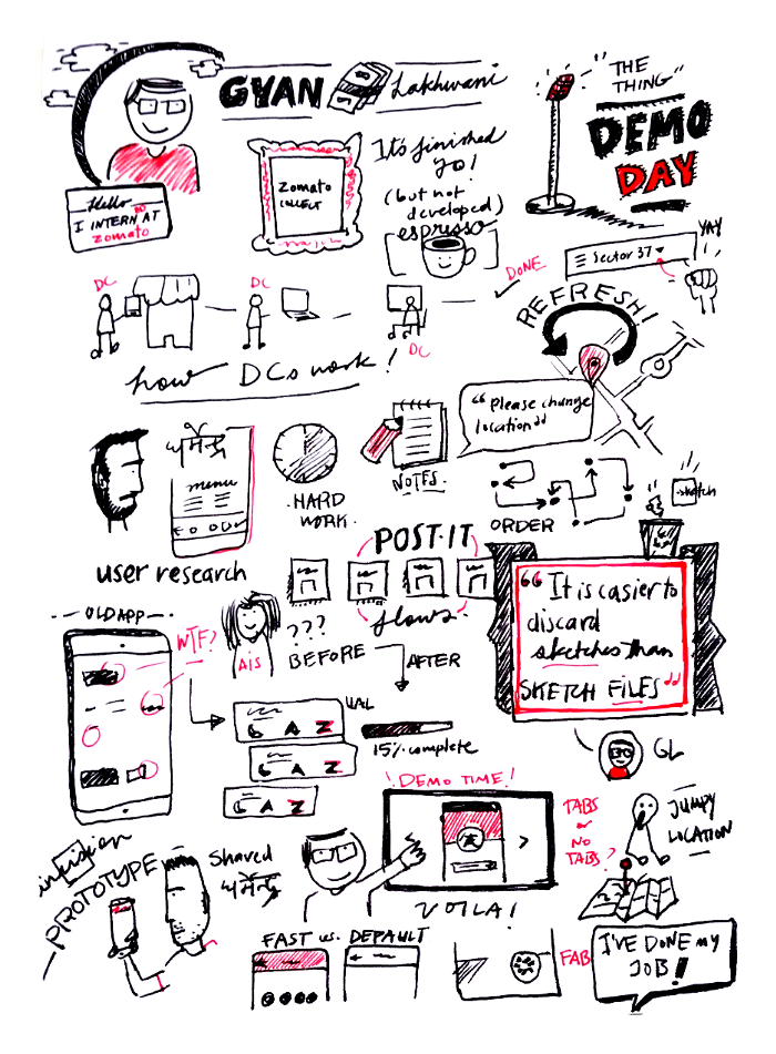
My boss Ashish Goel sketch-noted my final presentation to the team.
I learned a lot this winter, and had a great time working with Zomato. Shoutout to the design team at Zomato for making me feel welcome and being all-round great to work with.
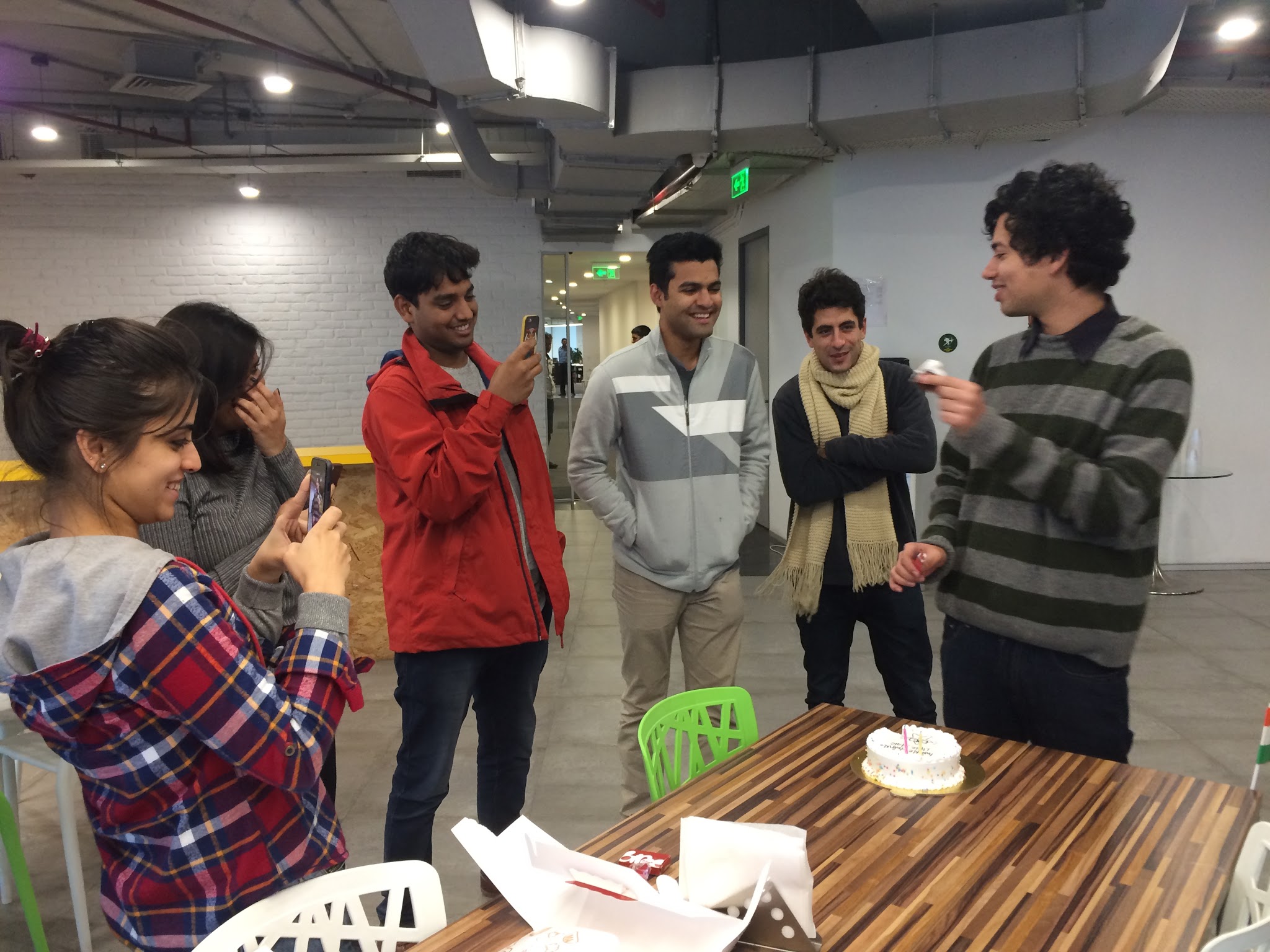
My team got me cake on my last day at work! From L to R: Kanika, Charu, Arpit, Pranu, Gui and me.
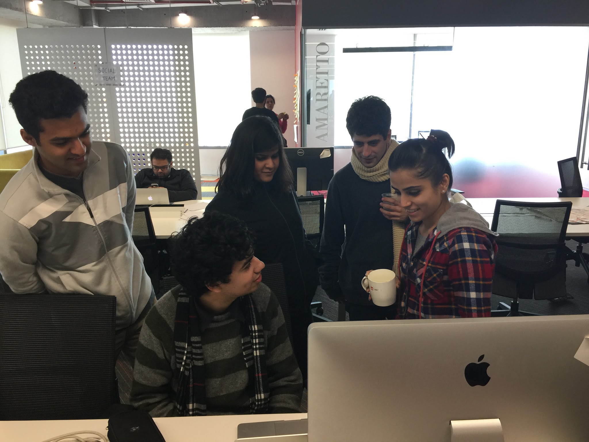
Feedback sessions at my desk.
